We’ve compiled a list of email design best practices to help you increase open rates, drive conversions, and grow your customer base in 2026.
Around 376.5 billion emails were sent and received worldwide every day in 2025. In Brevo's study of email marketing campaigns from the top ecommerce companies, we found that North American businesses send 25.57 emails over 30 days — much higher than the global average.
Yet many of these emails remain unread, or even worse — unopened. They get marked as spam, deleted, or completely ignored.
That’s why a well-designed email is essential to drive engagement and conversions. You want people to feel compelled to click through the email the moment it reaches their inbox. Use these email design best practices for greater ROI and fewer unsubscribers.
To make the most of these email design best practices, follow along in your Brevo account and create your own stunning email content. Don’t have an account yet? Create one today!
The top email design practices explained
1. Specify your sender name
Your sender name is an essential element of email design. It massively influences your open rates. As the first thing your contacts see, it’s arguably more important than your subject line. Why? It establishes trust from the get go.
Frequent email users know how to sort out the good from the bad. It’s a subconscious thing they do to filter hundreds of emails daily. Your contacts look at the sender name to determine whether or not an email is spam.
Incorporate your brand name into your sender name. This helps establish trust and separates you from spammy content.
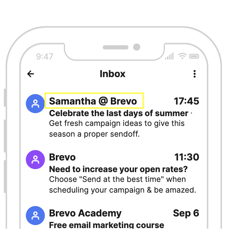
Example of an email sender name
Use your company name on its own, to reinforce brand recognition. Or personalize it with an employee’s first name. For example, using ‘Sarah at Brevo’ is an effective way to engage your contacts on a more personal level.
Many larger companies use a sender name to differentiate departments, products, and services. For example, ‘Brevo News’ or ‘Brevo Customer Service’ reveals key information about the message.
The most important thing is that your sender name displays a real name — not an email address.
2. Grab attention with your subject line
You want your email subject lines to be short, informative, and to capture the attention of your reader. Make sure to highlight the most important message to communicate. Be upfront. Most users will only take a glance, so you need to grab their attention within the first few words.

Subject line examples
The average character limit set by various email providers is 50 characters. Aim to keep it or your subject line will be cut short. And remember that mobile users see even less of the message.
TIP: Don’t overdo it with excessive capitalization, special characters, or punctuation. Not only does this kind of messaging make your brand seem less trustworthy, but the email could also end up being classified as spam.
Check out more subject line ideas for specific campaigns:
3. Customize your preheader text
Preheader text is the short snippet of text. It immediately follows the subject line when viewing an email in the inbox. Preheaders add valuable context to your subject line and can also boost your open rates.
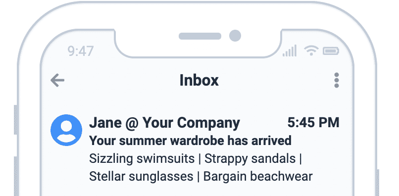
Example of preheader text
The subject line and preheader text should go hand in hand. Together they tell your readers a story. Without customizing, it will read as the text that first appears in your email. This means your preheader could be "View this email in your browser.” Now that wouldn't give the best first impression, would it? Learn more about email preview text here.
4. Get personal with your content
This year we expect to hear less and less about B2B and B2C marketing. 2026 is about human-to-human marketing.
We are seeing a shift away from sending generic, one-to-many emails. Instead, personalization is trending. Email design best practices favor sending one-to-one emails tailored to customer behavior.
Features like email automation, lead scoring, and segmentation help tailor content to individuals. This leads to emails that are dynamic, innovative, and relevant to subscribers.
Take your emails further than first name greetings. Adapting content based on user interests and behavior truly personalizes your emails. For example, you can send personalized product recommendations, offers, and abandoned cart emails.
Take a look at this example. It incorporates a live countdown timer leading up to an event. Animations like this create a sense of urgency and inspire customers to commit to purchasing.
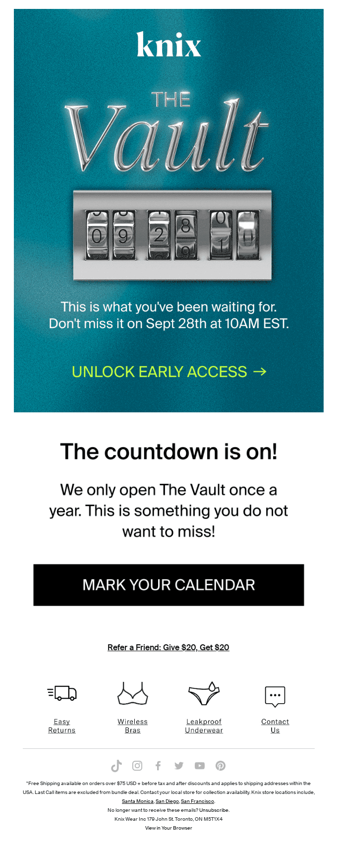
Countdown timer example (Source)
Make your emails count. Personalized emails with dynamic content will not only set your brand apart, but also forge stronger connections with your customers.
5. Design your emails using visual hierarchy
As consumers, we tend to follow predictable patterns when engaging with content. Visual hierarchy helps to guide readers' attention in emails, directing readers to the most important elements.
Visual hierarchy is an email design best practice, as it allows people to scan content easily. Let’s take a look at two email layouts using visual hierarchy.
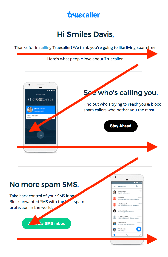
Z-pattern visual hierarchy (Source)
First, the Z pattern (or zig-zag) is an effective way to get subscribers to read through all your email content. This strategy plays on patterns of eye movement. Reading left to right, we have a tendency to jump ahead when engaging with content.
Keep users interested by spreading eye-catching content throughout the message. This reduces the chance of them getting bored halfway through.
Second, the inverted pyramid email layout is another strategy to consider. The top of the pyramid catches the reader's attention. Then you narrow their focus to the primary goal of your email. This might be a call-to-action, product feature, or special offer.
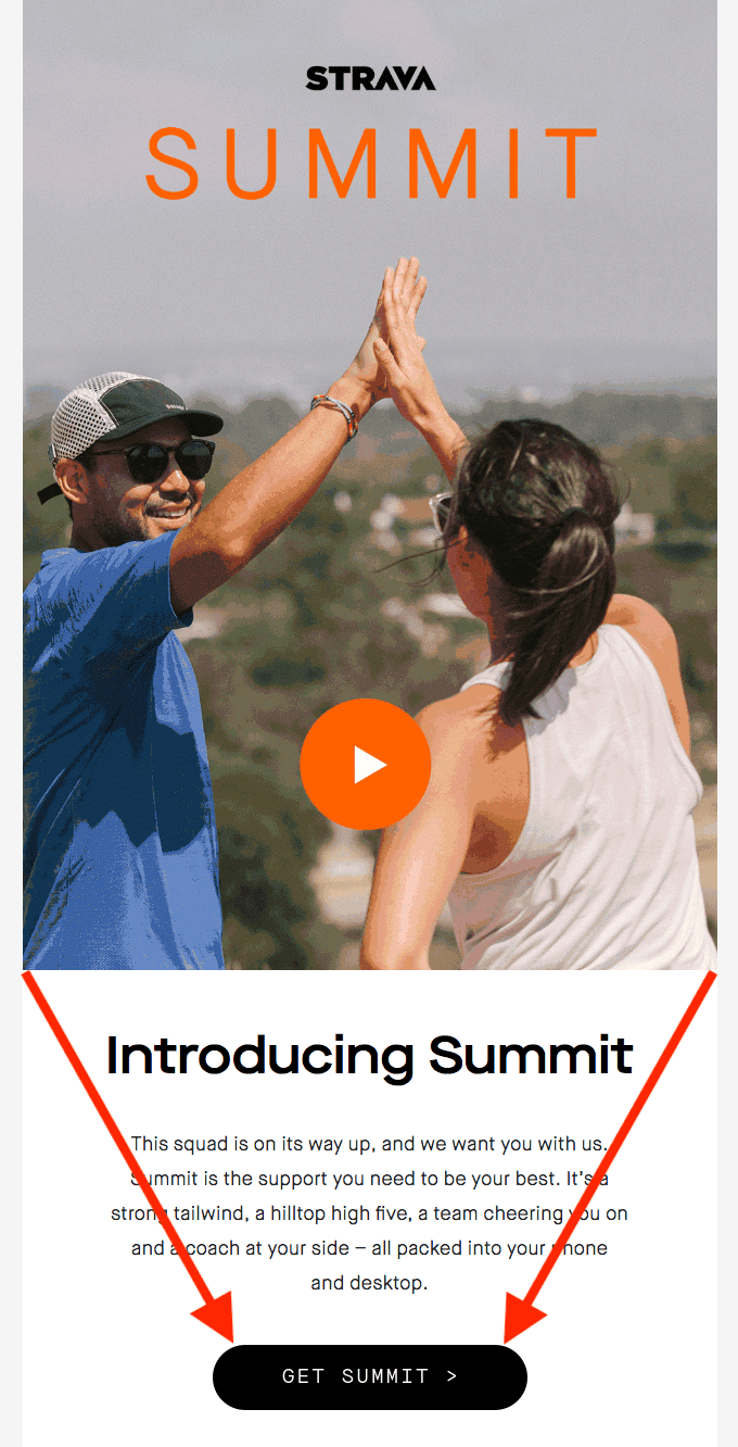
Inverted pyramid visual hierarchy (Source)
Some final tips on email layout:
- People tend to place more value in objects that are larger. Highlight important information with larger text, blocks, or bolder fonts.
- People also perceive elements higher up on the page as more important. Start your email with your key points.
- White space helps to separate different parts of your content. Use it to communicate information in a clear, organized and attractive way.
6. Use an email template
You don't have to be a graphic design expert to craft beautiful emails. Using an email newsletter template is a great way to get started.
Email templates help speed up the design process. They also give your content a professional-looking structure.
Be sure to use responsive email templates. The responsive design automatically converts the layout to suit desktop, tablets, and mobile devices. It ensures your content is viewable and accessible on multiple platforms.
Our team at Brevo looked at hundreds of email marketing examples from the top ecommerce companies. We found that 97.2% of emails were responsive.
Discover more Brevo Insights.
Brevo's email marketing tool has a beginner friendly drag-and-drop editor. No need to know HTML or code. Just pick one of our 40 email templates, move the design around, and add your text.
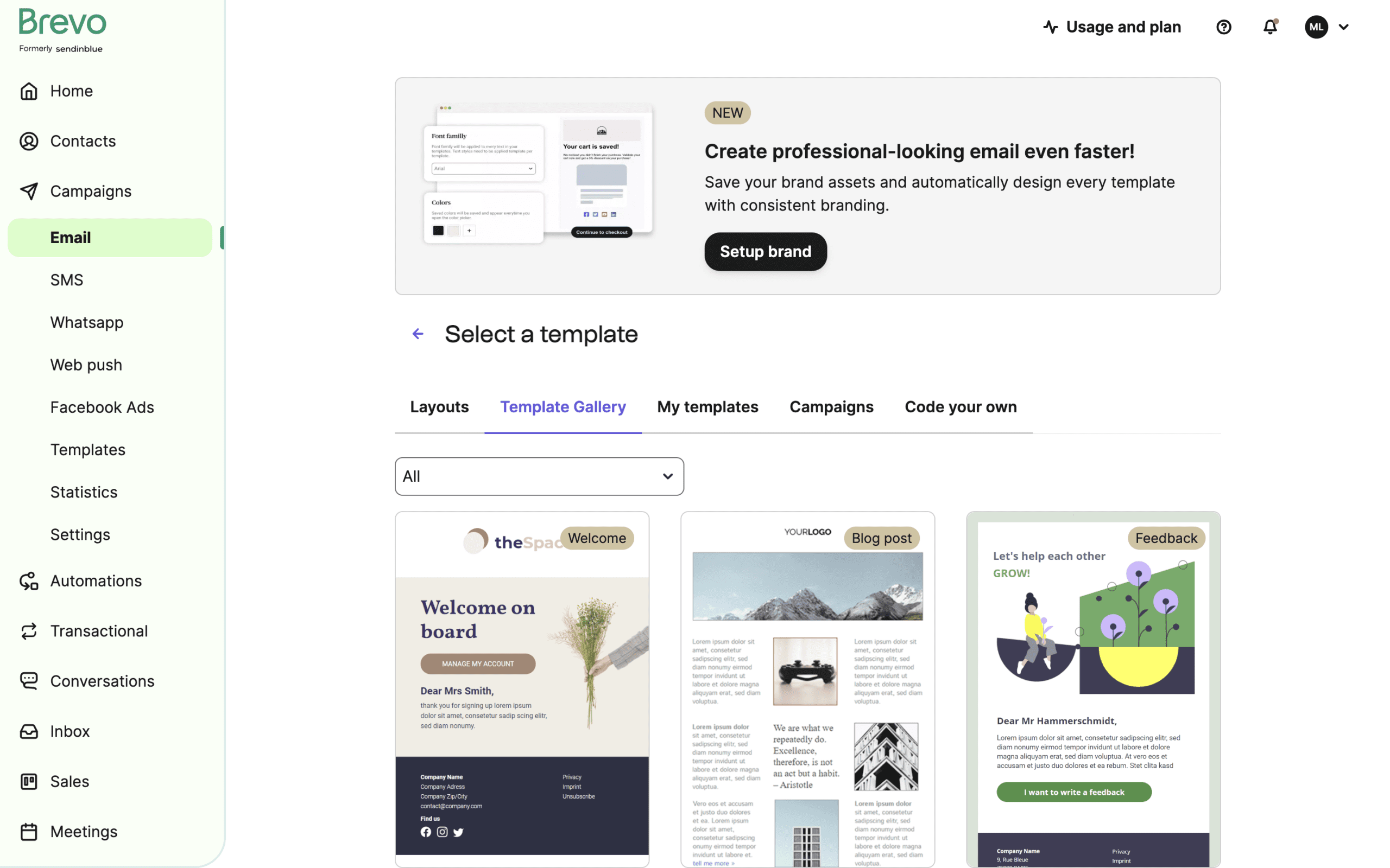
Brevo's free email template gallery
7. Stay consistent with brand identity
Don’t feel obligated to stick to a template’s design features. Templates are a great foundation for effective email design. But they’re also an opportunity for your brand image to shine through.
In fact, we recommend changing anything that isn’t consistent with your brand image.
You can upload your brand assets to Brevo and save them in your brand library. This way you can stick to the same design elements like color scheme, fonts, headings, and footers.
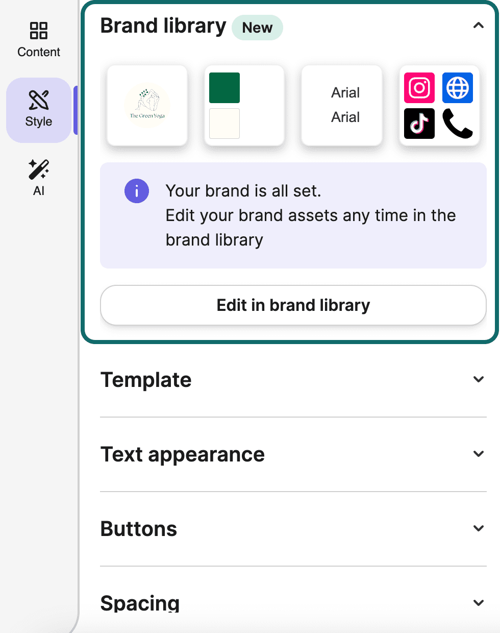
Brand library example in Brevo
Small details like your logo and signature go a long way in building a sense of identity. When your brand image is consistent, people start to trust and rely on your brand more.
Email marketing design doesn’t have to be only for the big guys. Businesses of all sizes can create a brand image for their email campaigns. For inspiration, check out Coolors.co. Their site lets you experiment with different color palettes. It’s perfect for discovering your brand colors.
8. Write engaging copy
Remember that people will be skimming your content when writing your email copy. Long chunks of text will lose your readers’ attention very quickly.
Using short, concise sentences, bulleted lists, and headlines will keep your writing digestible. An easy layout makes sure that no one will get lost in your content.
Your tone of voice is also important to nail. You want your writing to appeal and make sense to your target audience. Emojis might work for some, but not for an older, more traditional demographic.
Being creative with your design elements is always encouraged. But we recommend keeping it simple with your fonts. Super artistic and complicated font styles might not show up on all email servers. Stick to email-friendly fonts instead.
9. Add images where they add value
Photos are a great way to break up your email message and make your content a bit easier to digest.
However, sending emails with too much visual content can result in a few scenarios:
- Emails taking a long time to load
- Issues in displaying the content
- A vague, unfocused message to your audience.
To avoid these pitfalls, be sure to always ask yourself what kind of value an image adds to your content.
Use clear product photos, introducing team members, or adding infographics. Using irrelevant stock images or very large files will only win you unsubscribers.
Looking for more ideas on email marketing campaigns and newsletter design?
10. Feature user-generated content
According to the 2021 Edelman Trust Barometer Report, 81% of consumers make buying decisions based on brand trust.
More often than not, people trust peer recommendations over brands. So why not let your customers have a say in your email content?
What is user-generated content?
User-generated content is anything that people create and share online about a brand. This includes product reviews, customer feedback, photos, and social media posts.
It provides social proof and reinforces your brand's credibility. Using real-life examples humanizes your brand. It makes your storytelling more relatable, and starts conversations through your emails.
Through targeting and segmentation practices you can tailor your user-generated content to individuals. For instance, a sports equipment store might segment and target their customers by preferred sport.
Including relevant buyer reviews to your email is a powerful conversion method. Here’s an example of it in action:
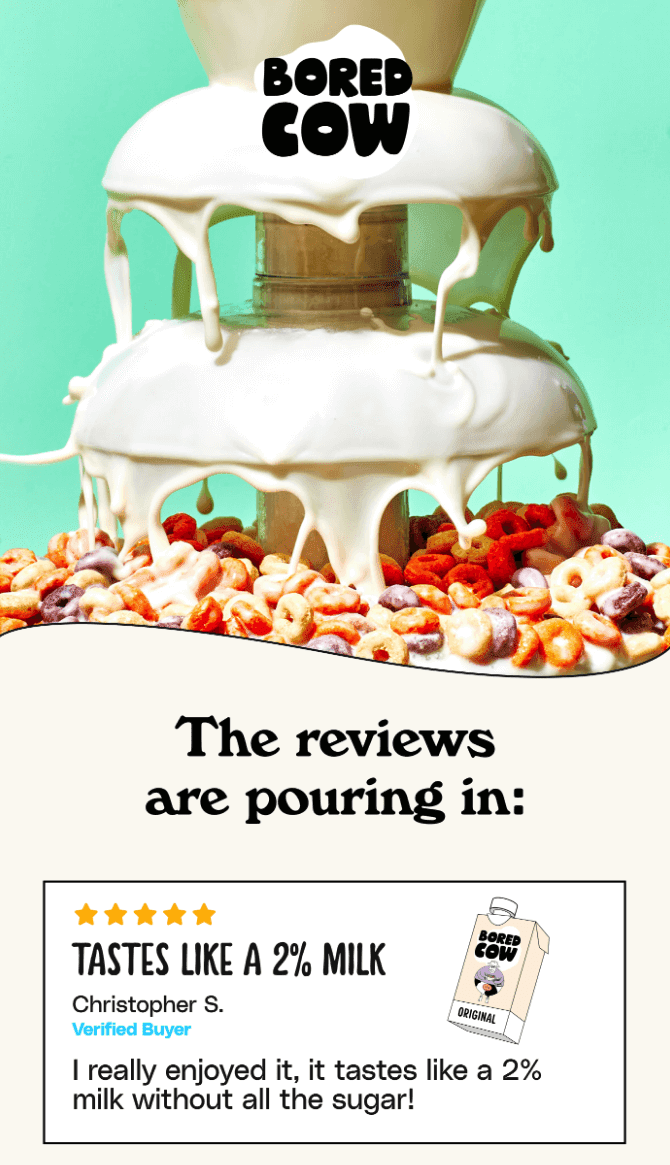
User-generated email content (Source)
11. Use interactive content in your email design
Interactive email design allows users to interact with content without leaving the email. It’s a powerful way to boost engagement.
Interactive elements create a sort of gaming experience within the email. It not only improves engagement, but provides a better user experience. Why? Because users interact with email content without the need to follow links. Take a look at this example of an embedded quiz in an email from Harry’s:
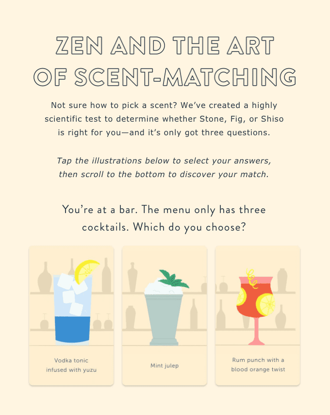
Here are some exciting interactive email elements to consider:
- Animated buttons and call-to-actions
- Product carousels
- Rollover effects to showcase products and offerings
- Accordion features to make your emails more compact
- Add-to-cart functionality
- Polls and surveys
Much of this content requires skills in HTML and CSS to create. Brevo's free email templates offer an HTML email editor. So you can import an HTML template from elsewhere and work on it in Brevo.
NOTE: Not all email clients may display interactive design elements correctly, so consider creating segments for email clients (Gmail, Apple Mail, etc.).
12. Ensure emails are accessible
Great email layout is vital for accessibility. It’s important to make your email easily readable for all contacts, including visually impaired people.
Alt texts describe your images for those who cannot see them. Also, make sure the background color of your emails allows for easy reading.
Programs such as the KNFB Reader scan content and read it out loud for visually impaired, dyslexic, and other print-disabled users. That's why it's essential to lay out your content clearly and optimize its readability.
Dark mode
Dark mode is a display setting on many devices, apps, and operating systems. When activated, it changes the color of the user interface. It’s a common preference for many email users.
It provides comfort by reducing eye strain and enhancing content visibility. Therefore, it's crucial to design your emails to be dark mode-friendly.
Before sending your email, we recommend you preview it on different email platforms. You can do this directly from Brevo after designing your email. Previewing lets you check how your email will look in dark mode.
13. Experiment with A/B tests
A/B testing compares two versions of an email. Change one thing between versions A and B. This can be a headline, subject line, or a call to action. Then, measure which performs better.
In Brevo you can A/B test subject lines and email content.
For example, you might want to measure which subject line results in higher open rates. Here are some ideas of opposites you might want to test:
- Emojis vs. no emojis
- Question vs. exclamation marks
- Discount vs. urgency
- Capitalization vs no capitalization
- Fun vs. serious
- Images vs. no images
- Colorful vs. monochrome
- One CTA vs more in email body
A/B testing is a great email design best practice. It helps you improve your marketing strategy and make data-driven decisions about which elements work best for your campaigns.
14. Drive action with CTAs
A call-to-action (CTA) is a button or link that encourages you to do something. A CTA (also known as an action button) might lead users to a landing page, subscription form, or a download page.
This practice helps boost click through rates. Laying out your email to guide your contacts to a call to action is like giving them a gentle nudge.
The text on your CTA buttons should be specific and to the point. For example, for a new product line, you could say, "Explore our new collection." For a promotion, you might use, "Save 20% on shoes."
Phrases like “read more” or “learn more” are better suited for lower level CTAs.
15. Include an unsubscribe button
Making your emails user-friendly means including an unsubscribe button in your emails. Allowing readers to easily opt out shows you’re operating in good faith.
What’s more, the new anti-spam regulations by Gmail and Yahoo require you to make it easy for users to unsubscribe.
Failing to do so loses you brownie points with email servers. If your unsubscribe button isn't easy to find, they'll mark your email as spam. This leads to poor email deliverability.
Always have an unsubscribe button at the top of your emails. In Brevo, it’s enabled by default.
Adding an unsubscribe link in the email footer is optional. However, we recommend this as a best practice for user experience.
Put these email design best practices to use with Brevo
Email design trends, like all digital marketing trends, will come and go. It’s easy to find yourself working on the latest shiny thing, only to discover it was a short-lived fad.
That’s why it’s important to keep your efforts centered on what matters most. Trust, personalization, and effortless user experience. With our email design best practices, you'll be creating excellent email campaigns in no time.


