An email CTA (call to action) can have a surprisingly strong impact on an email campaign’s effectiveness. These few words can make or break your email performance, no matter how good your content is.
What’s so powerful about an email call-to-action, and how do you create the one that works for your audience? To answer these questions, we’ve collected over 100 email CTA ideas, picked the best real-life call-to-action examples, and shared seven proven best practices for turning this short piece of text into an effective conversion driver.
Read on to discover what gets CTAs clicked on and get some fresh ideas for your email campaigns.
Table of contents
A quick email call to action 101
For those new to email marketing, let’s start with the very basics. What’s a CTA in email marketing?
An email call to action, or CTA, is a piece of text or a button that invites a user to take action, like reading an article or buying a product.
In this article, we’ll refer to any action you might want to drive with a CTA as a conversion. So in this context, a CTA is a conversion driver that helps you achieve the email campaign goal, be it increasing website traffic or selling more product bundles.
5 features of a great call to action
What makes a good call to action? An effective CTA is:
Action-oriented
It should be clear from its name that a CTA should call to action. This means it must include a command verb that tells the subscriber what to do.
Effective CTAs contain action words, like buy, learn, read, discover, download, etc. These words make it clear to readers what exactly their next steps should be.
Short
A call to action in email doesn’t have to provide every tiny detail about an offer — you have your subject line and email content to communicate everything a subscriber needs to know. With a short and to-the-point call to action, it’s easier to catch the reader’s attention and drive them to the desired action.
Concise
A good CTA is straightforward and concise. It’s brief but comprehensive.
For instance, instead of calling subscribers to ‘Visit Website,’ a concise CTA will offer them to ‘Browse New Collection 10% Off.’
Distinct
Ideally, your CTA should be placed within a button. It’s pretty hard to miss (or ignore) an eye-catching CTA button that uses strong contrasting colors.
Alongside optimizing the text of your CTA, think of a design that will strengthen its performance by making it bold and noticeable.
Compelling
Lastly, a converting CTA is compelling. Here are some of the features of an irresistible CTA:
- It evokes an emotional response.
- It creates a sense of urgency.
- It focuses on the benefits of an offer.
- It appeals to the user’s self-interest.
Say you’re promoting a giveaway with an email campaign. Which CTA is more concise — ‘Win a Gift’ or ‘Participate in a Giveaway’? The first example is short, appealing, and makes it clear why a user should take an action. The second one is heavier and highlights no benefit in joining the contest.
103 CTAs you should try in your emails
Below are 103 examples of email marketing CTAs to try in your email campaigns. Use them as they are or as templates to build creative, specific CTAs for your customers.
Newsletter CTAs
These are newsletter call-to-action examples to entice your subscribers to read (or watch) content on your website, social media accounts, or elsewhere.
- Discover how….
- Read about…
- Learn more
- Find out more
- Find out how…
- Read on to master…
- Read the full story
- Keep reading
- Show me how…
- Uncover…
- Learn why…
- How it works
- See more news
- Dive in
- Get the full recipe
- Download your copy
- Discover recent trends
- Watch now
- See what’s new
- Take me to…
- Explore more ideas
Sales CTAs
These CTA examples will inspire you to create converting call-to-action buttons for promotional email campaigns (especially for B2C marketing).
- Buy now for…
- Shop now
- Activate your discount code
- Explore new styles
- Shop sale
- Order now
- Order [product name]
- Get [product name]
- Add to cart
- Shop what’s new
- Shop new arrivals
- Shop new collection
- Try it out
- Try [product name]
- Pre-order now - [price]
- Shop bundle
- Get men’s/Get women’s
Abandoned cart CTAs
Abandoned cart emails should be friendly reminders for consumers to go back to your website and complete the purchase. It’s easier to drive sales from people who have already shown interest in your products, but you still need a strong CTA.
- Keep shopping
- Take another look
- Use your discount
- Return to cart
- View my cart
- Finish checkout
- Continue to checkout
- Complete my order
- Take me to my order
- Resume your order
- Seal the deal
- Reveal new price
- Check out with 15% off
- Checkout now
- Activate free shipping
Repeat purchase CTAs
Replenishment emails, upsells, and cross-sells — these emails should help you drive more repeat purchases and build strong relationships with existing customers. Use concise CTAs in your post-purchase emails to encourage customers to buy from you again.
- Buy again
- Get some more
- Reorder now
- Upgrade now
- Top up
- Restock now
Seasonal CTAs
During the holidays, your competition is doing its best to win your audience’s attention. You’ll need a strong CTA to create an appealing offer. CTAs in seasonal email campaigns typically include the words “gift,” “discount,” “sale,” and “deals.” See for yourself:
- Shop gift guide
- Grab offer now
- Claim your coupon
- Buy 15% off before Dec 25
- Explore discounted offers
- Get [Product name] 30% off
- Get my gift
- Shop final sale
- Shop the limited editions
- Shop holiday deals
- Shop holiday sale
- Shop express gifts
- Shop now and save
- Shop gift cards
- Start gifting
- Redeem your offer
- Browse Father’s Day offers
- Get mom a [Product name]
- Save $15
- Give an e-gift
- Get it by Christmas
- Apply discount
SaaS CTAs
SaaS email campaigns differ a lot from ecommerce emails. Therefore, SaaS CTAs deserve particular attention:
- Yes, I’m interested
- Enroll for free
- Sign up for free
- Start a free trial
- Get ready now
- Save 50% on subscription
- Join now
- Request demo
- Book a call
- Explore features
- See [Product or Feature] in action
CTAs to collect customer feedback
If you use email marketing to collect customer feedback, you’ll need a strong CTA that encourages people to spend some time answering your questions. Here are some of the most common CTA examples for this occasion:
- Take the survey
- Share your opinion
- Share your thoughts
- Tell us what you think
- Tell us how much you like it
- Help us improve
- Leave a review
- Write a review
- Vote now and earn $10
- Begin 1-minute survey
- Rate [Company name]
12 best email call to action examples
Let’s see some of the best email call-to-action examples by SaaS and ecommerce brands to inspire your email marketing strategy.
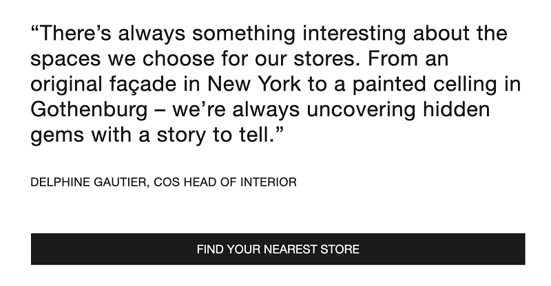
1. “Find your nearest store”
71% of customers prefer to make first-time purchases in a physical store. This is why COS, an international clothing brand, runs email marketing campaigns not only to drive online sales but also to encourage customers to buy in-store.
The ‘Find your nearest store’ CTA attracts customers’ attention to the brand’s physical stores and boosts retail sales.
2. “Don’t walk… Run”
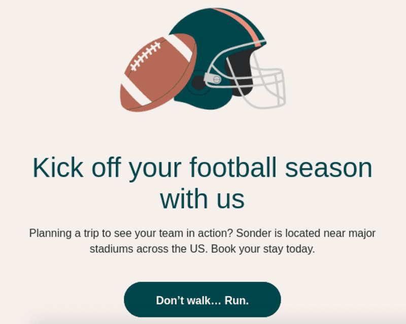
Sounds weird. Why did we choose this example?
Although this exact phrasing won’t fit any other campaign, it’s a distinct example of a truly creative CTA button. The call to action is playful and intriguing, making subscribers want to click on it. What’s most important, it’s highly relevant to the campaign topic and appeals to the target audience.
3. “Check out our prescription skincare”
This CTA example by Nurx should inspire your future content promotion campaigns. While we do recommend that you keep your call to action short, sometimes it makes sense to go for a longer text (e.g., to include some context).
Instead of the ‘Learn More’ CTA, Nurx has chosen more specific phrasing that sets the right expectations for the reader.

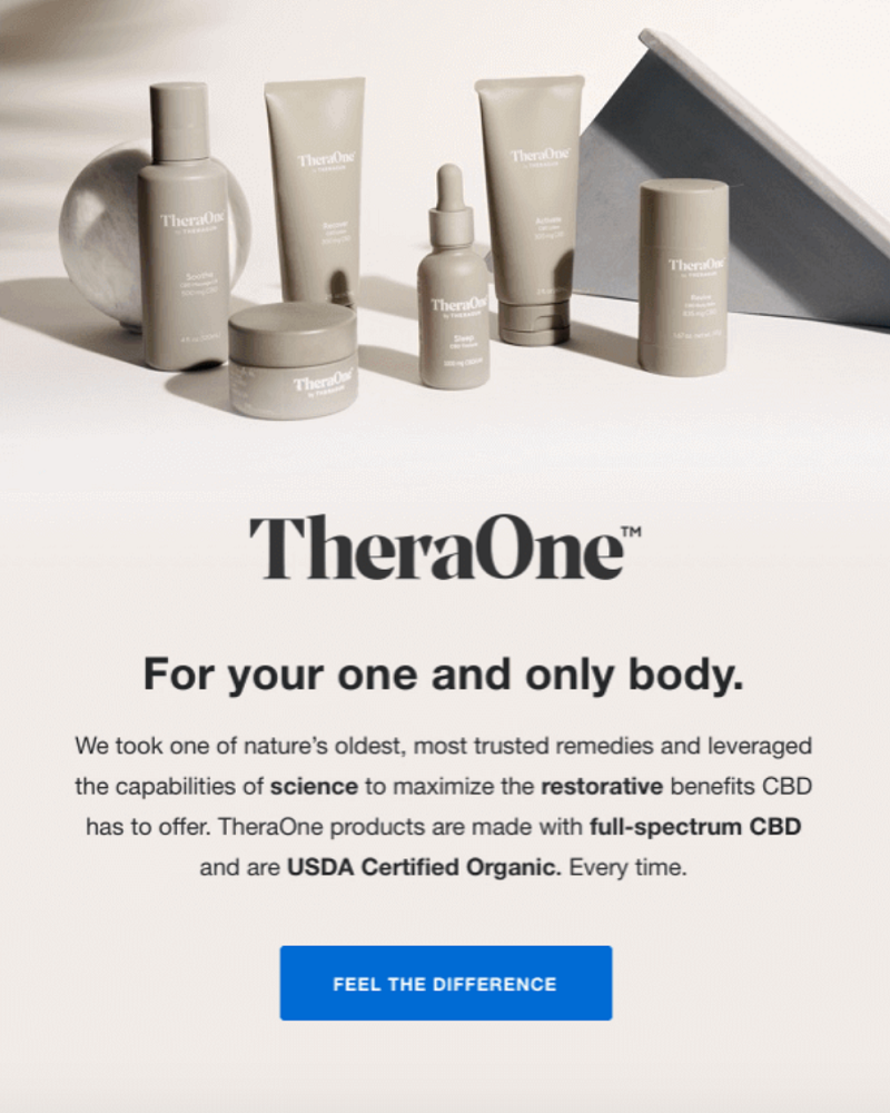
4. “Feel the difference”
TheraOne has also chosen a more creative CTA than a simple ‘Order Now.’ The call to action invites users to try TheraOne’s skincare products by promising a tangible result.
5. “Claim it!”
Cart abandonment emails are bread and butter for ecommerce. But to make them work, you need to be really careful with your email content and CTAs.
To win back cart abandoners, AYR uses minimalistic copy and a short but powerful CTA. Oftentimes, there’s no need to reinvent the wheel — keeping it simple is just fine.

6. “Shop the final hours”
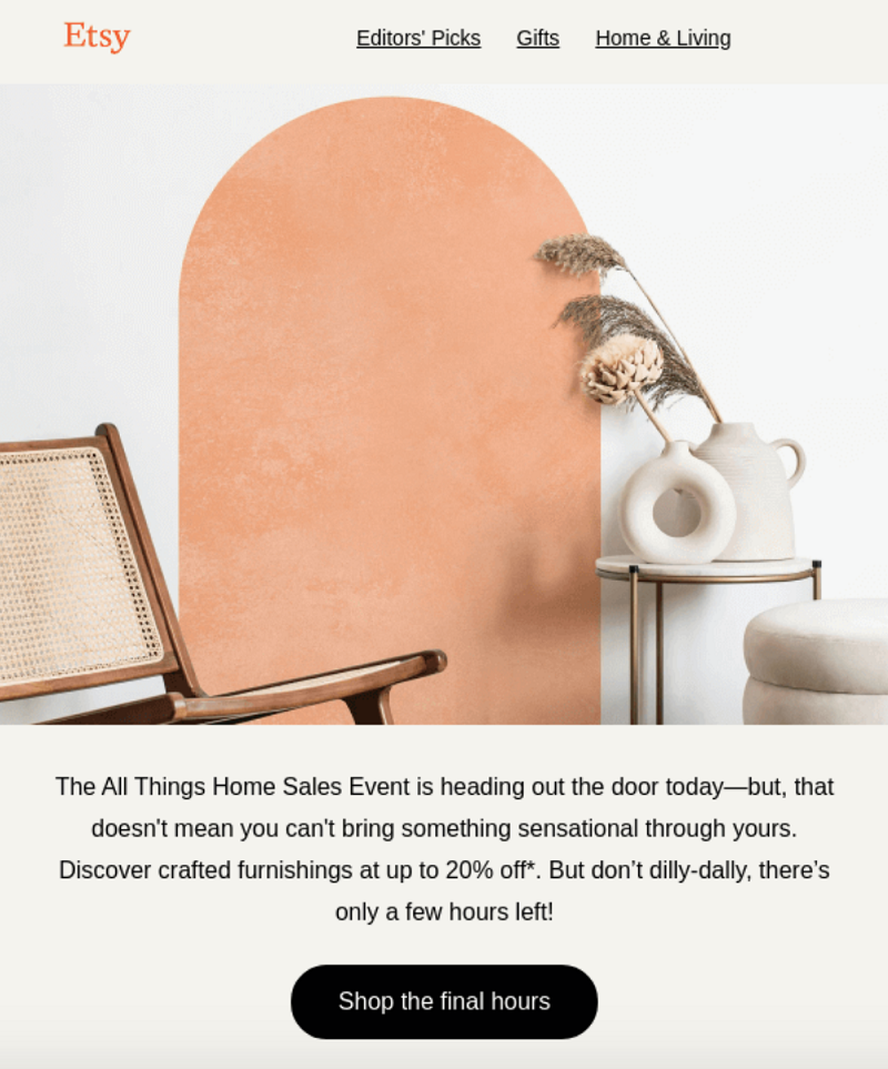
Remember we mentioned a good CTA should create a sense of urgency? This is the one.
While mentioning the sale is on for only a few more hours, Etsy also highlights it in the CTA. This CTA might be particularly effective for converting customers who had been browsing discounted offers earlier but haven’t made a purchase yet.
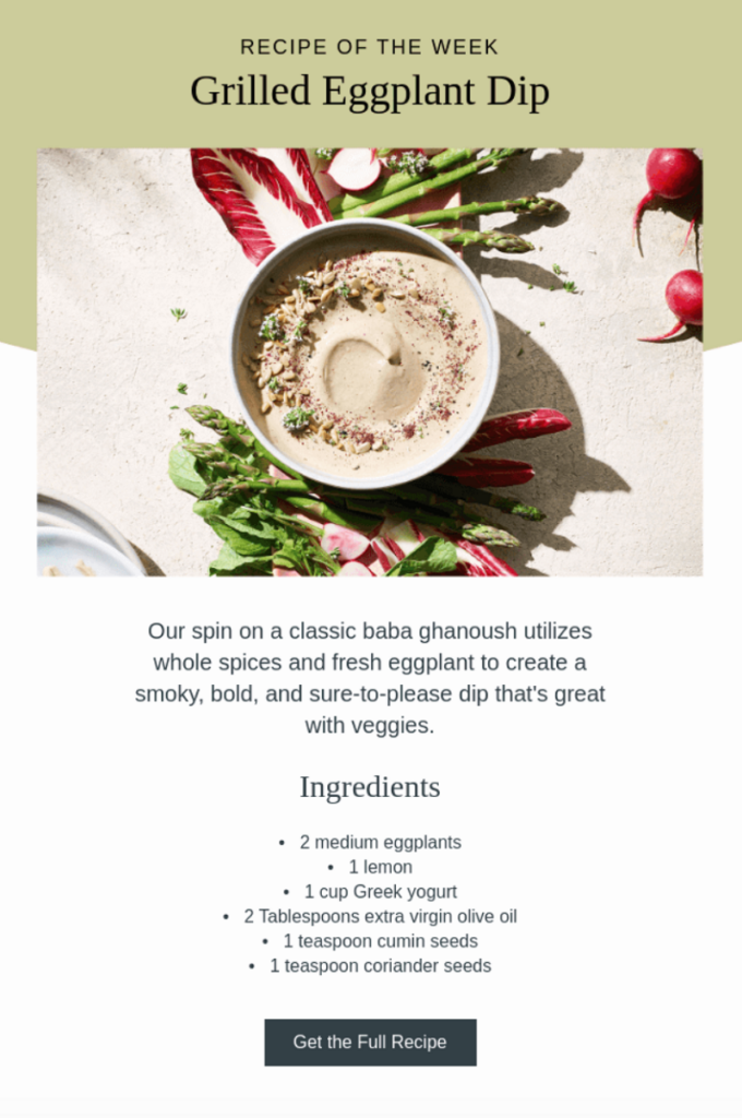
7. “Get the full recipe”
Content promotion campaigns have the lowest click-through rates (CTRs) of all email types. To increase clicks from your newsletters, you’d better use a strong CTA.
In its weekly campaigns, Vitamix offers a teaser of the recipe of the week followed by an email CTA that invites readers to see the full recipe. This is a perfect combination of email copy and a CTA when you need to generate interest in your content and make people click.
8. “Free? Sign me up!”
Dovetail uses email marketing to promote blog content, offline events, and webinars. The following campaign features a CTA containing simple yet powerful words: “Free? Sign me up!”
By using the word “Free” in the CTA, Dovetail appeals to people’s love of free stuff. The exclamation mark adds emotion and excitement to the copy.

9. “Discover the benefits of coding”
Here’s one more content promotion campaign that doesn’t feature a “short and sweet” CTA.
The call to action in this email speaks to parents that are still not sure whether and why their kids should learn to code.

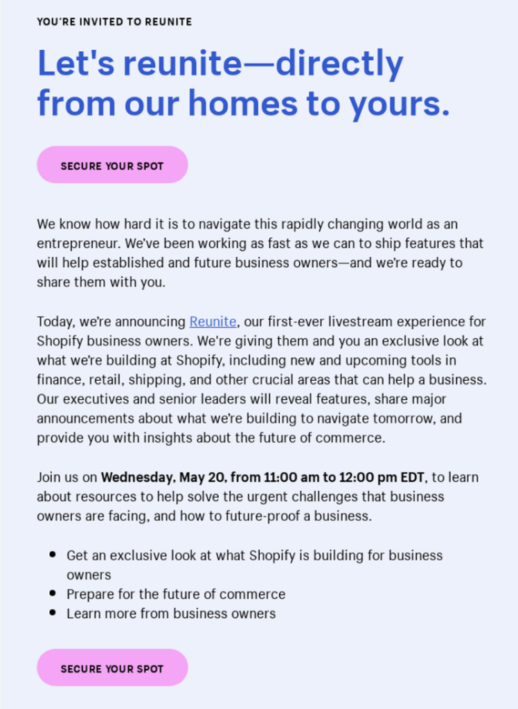
10. “Secure your spot”
Although there’s nothing special about the text of the following CTA, you should pay attention to its placement.
Shopify has prepared a lengthy text to promote the upcoming webinar. If they placed the CTA at the end of the email, a lot of people wouldn’t make it to this point. That’s why they’ve included an additional CTA button above the fold.
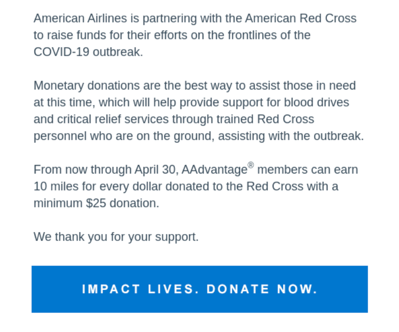
11. “Impact lives. Donate now”
American Airlines partnered with the American Red Cross to raise funds to fight the COVID-19 pandemic. To encourage people to donate, they needed a strong CTA. Alongside the actual call to action, the company has highlighted the key benefit of donating money, which is making an impact.
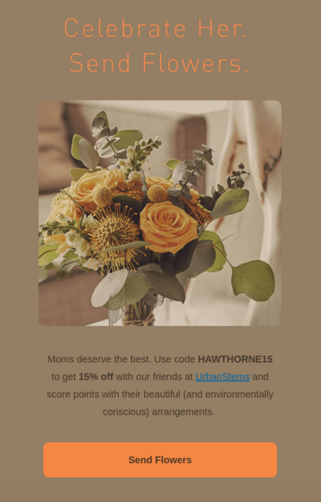
12. “Send flowers”
The Hawthorne email marketing team could have used a common CTA, like ‘Buy Now or ‘Order 15% Off’ — yet they’ve chosen a CTA that focuses on the target action.
Customers usually don’t want to buy something, they want to achieve a certain goal. In this case, the goal is to send flowers and please their loved ones. That’s what Hawthorne stressed with this CTA.
4 CTA mistakes that hurt email performance
And now, let’s talk about CTAs that will break your campaign performance.
Multiple CTAs
Using multiple CTAs is the best way to drive a user away from taking any action. Here’s a great example of what you shouldn’t do:

No CTA button
An email that doesn’t include any CTA won’t show equally strong performance as an email with a CTA.
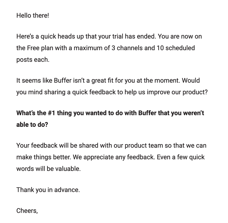
No actual call to action at all
It matters what message you include in your CTA button. If you don’t use an action verb, you’re giving no directive to a user.

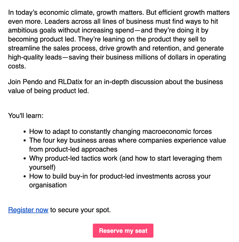
Wrong placement
A tiny CTA added at the end of your email copy has a low chance of getting noticed.
7 email CTA best practices
You’ve seen plenty of call-to-action emails and examples in this post. Now, you’ll learn how to develop these CTAs into powerful converters.
1. Stick to one CTA per email
The more different CTAs you include in your email copy, the further you drive your subscribers away from the desired action. Use one or (maximum) two CTAs per email to keep your audience focused on a specific action.
Secondary CTAs can be used for related actions (like seeing different kinds of products in the same category, or reading another user testimonial), but it’s best to make a clear separation in your email design.
This rule doesn’t apply when you need to include duplicate CTAs because your email content is long.
2. Keep it relevant
You may create a super engaging CTA that drives a 100% CTR. But it will deliver no results if the landing page has nothing to do with what’s been promised in the CTA.
Keep your CTA relevant to the destination. It’s also good to include a similar text or CTA on the destination page — it will work as a signal that visitors landed on the right page.
3. Mind the placement
Your CTA button should be the most noticeable element of the email layout.
The best place to put a CTA in your email is as close to the top as possible. This way, your subscribers can’t miss it.
Have you created a long email copy? Add an extra CTA above the fold.
4. Eliminate objections
When crafting compelling CTA copy, think of the objections your customers might have against clicking on it. Try to address those objections with the text of your CTA. The most common examples of this approach in action are “Sign up, it’s free” and “Take a one-minute survey.”
5. Be specific
You shouldn’t underestimate generic CTAs like “Shop Sale” or “Order Now,” but whenever you can get more creative than that, do it.
Keep your CTA specific to the offer or the target audience. Highlight the benefit of clicking on it, address customers’ pain points, or simply use the name of the product within the CTA text.
6. Use power words
Power words are words that trigger a psychological response from a reader. You can increase conversion rates by simply including these words in your CTA copy.
What are some examples of power words? There are hundreds of them. The most commonly used power words are:
- Free
- Sale
- Limited-time
- Special
- New
- Challenge
- Expert
- Hurry
- Tips
- Hacks
7. A/B test your CTAs
Never stop testing your call-to-action copy. Here’s how to do so:
- Create a hypothesis: Do you think “Send Flowers” will drive more clicks than “Order Now”? Before you prove it, this is your hypothesis. It’s time to check with an A/B test.
- Create two identical versions of emails and include different CTAs: You should test one variable at a time. When A/B testing CTAs, don’t alter email copy or audience segments.
- Evaluate the results, repeat: There are so many things you have to test — from button color and placement to wording and size.
You can test things like first-person vs second-person language ('get my free meal' vs 'get your free meal') or even the color of your CTA email button.
With Brevo, you can A/B test any variables and get informative reports on the results of the tests. The platform will run two versions of campaigns against selected audience samples and identify the winning email version for you. You’ll also be able to run a side-by-side comparison of the performance of the emails being tested.
Create CTA emails that convert
Brevo’s Marketing Platform is the key to creating stunning email designs with user-friendly drag-and-drop templates. Import your brand elements, drop in your CTA buttons, and bring that traffic to your website!


