This guide will walk you through how to create a landing page in eight easy steps.
You don’t need to be a design expert to create a high-converting landing page for your marketing campaign. All you need is an understanding of the basic principles and best practices we’re sharing in this article.
Let’s explore the types of landing pages, how to create them, and why too much creativity is often the way to ruin your landing page performance.
How to create a landing page: Table of contents
What is a landing page?
A landing page is a standalone web page that promotes a specific offer or product. A good landing page has one goal and is typically designed for a particular marketing campaign.
Simply put, a landing page is where a user "lands" after clicking on your paid ad, promotional email, or any other marketing asset.
Every landing page has a target action, a.k.a. a conversion. Despite a common misconception, a conversion isn’t always about making a purchase. It can be downloading a free PDF, signing up for an online event, subscribing to a newsletter, or any other action you want your audience to take.
Whatever action you want your target audience to take, it’s best to guide them to it with a dedicated landing page.
Types of landing pages
Landing pages come in various shapes and forms, but they all fit into one of the following categories:
- Lead capture page
- Squeeze page
- Splash page
- Sales page
Lead capture page
This is a landing page designed to collect user information, such as names, phone numbers, and email addresses, which can be used for future marketing efforts.
A lead generation page usually includes:
- A lead magnet or incentive to encourage users to share their information (e.g. a free ebook, webinar access, or discount code)
- Brief information about the asset
- A prominent form for visitors to fill out
- Clear and compelling, directing users to submit their information
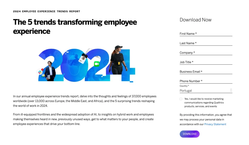
So whenever you need to design a page to promote your upcoming webinar, playbook, report, free tool, or any other lead magnet, it’s going to be a lead generation landing page.
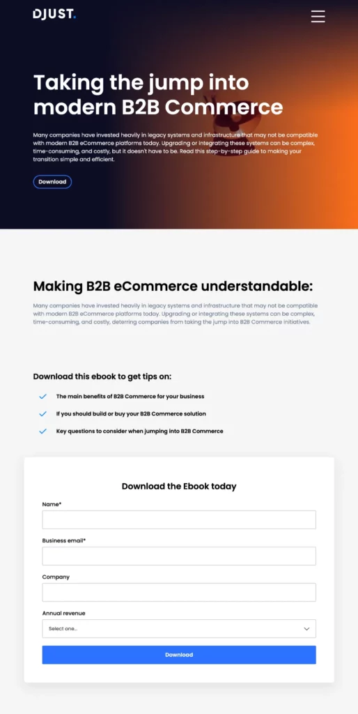
Example of a lead generation landing page (Source)
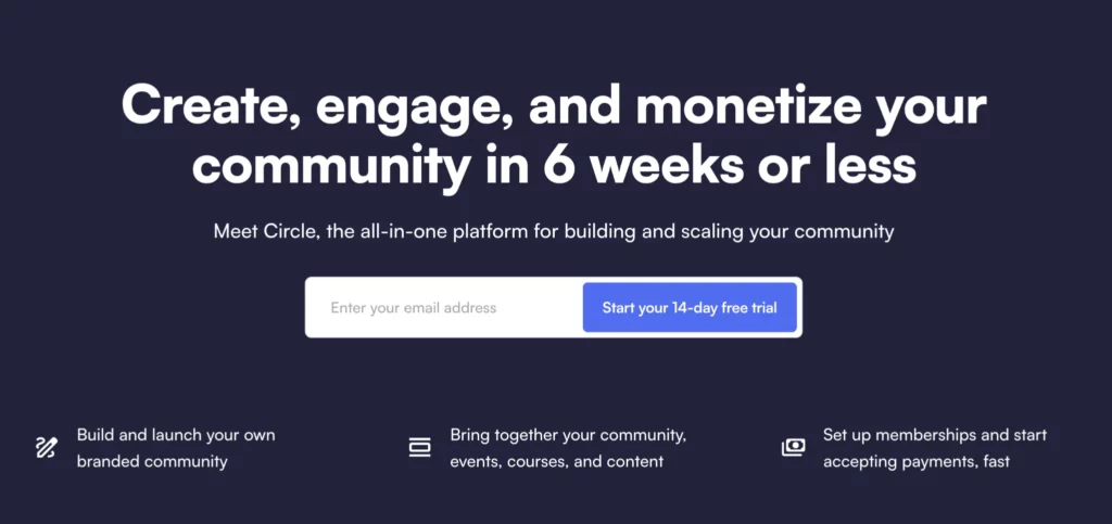
Squeeze page
A squeeze page is similar to a lead capture page but with a more narrow focus: it’s specifically designed to quickly collect email addresses. It’s typically shorter than a lead capture page and usually includes only a single-field form.
Despite these differences, these two share many features: both require an appealing lead magnet, include a contact capture form, and feature a clear call-to-action (CTA).
Why choose a squeeze page over a lead capture landing page?
In other words, why would you settle for just collecting email addresses when you could use a full-stack landing page to gather comprehensive lead information?
The answer boils down to the type of audience you’re targeting. A squeeze page is specifically designed to drive potential top-of-funnel leads into your marketing funnel. For many visitors, this may be their very first interaction with your brand, and sharing their email is the most they're willing to do at this point
As you build an email list and begin nurturing these new leads through various marketing strategies (like email sequences or paid ads), you can gradually qualify them and gather more detailed information using targeted lead capture pages.
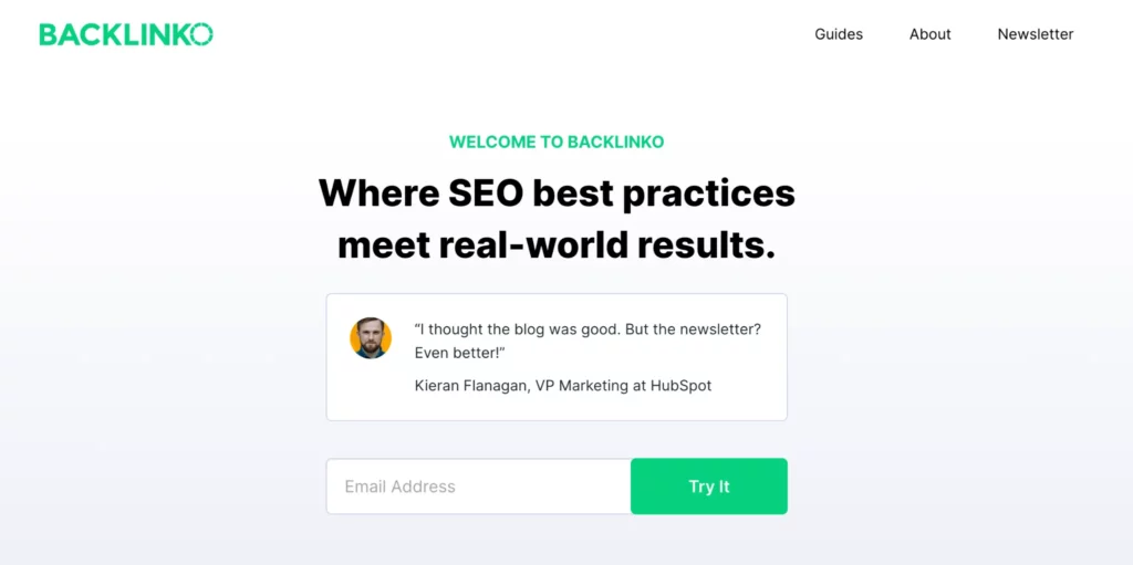
Using a squeeze page to collect newsletter subscriptions (Source)
Splash page
A splash page serves as an introduction or announcement page before entering a website or clicking through a specific offer. You can use it to:
- Promote a new product, special offer, or upcoming event
- Engage users with a video or other creative campaign before they land on a site
- Allow visitors to select their region or preferred language
- Present a disclaimer
- Separate traffic from different audience groups
- Ask for age verification
Typically, a splash page includes a single section (header) with essential details and may feature a call-to-action (CTA) or exit link, depending on its purpose.
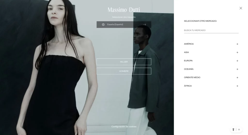
Example of a splash page (Source)
Sales page
A sales landing page is the culmination of a self-service buying process. It acts like a virtual sales rep, guiding users through the product’s benefits, addressing their concerns, and encouraging them to make a purchase through really good copywriting.
It’s often long-form and includes the following elements:
- An engaging headline that highlights the features and benefits of the product or service.
- Clear explanations of what the product or service offers, and how it solves the user's problem or improves their life.
- Testimonials, reviews, and case studies from happy customers.
- Images and videos that showcase the product or service.
- In-depth descriptions to answer any potential questions or objections.
- A clear and compelling call to action (CTA) encouraging users to take the next step.
- Transparent and detailed pricing options, sometimes with comparisons to other products or tiers.
- Information about money-back guarantees, warranties, and secure payment options to reassure visitors.
While it's advisable for all landing pages to focus on a single CTA, it’s particularly important for a sales page to be centered around one clear goal.
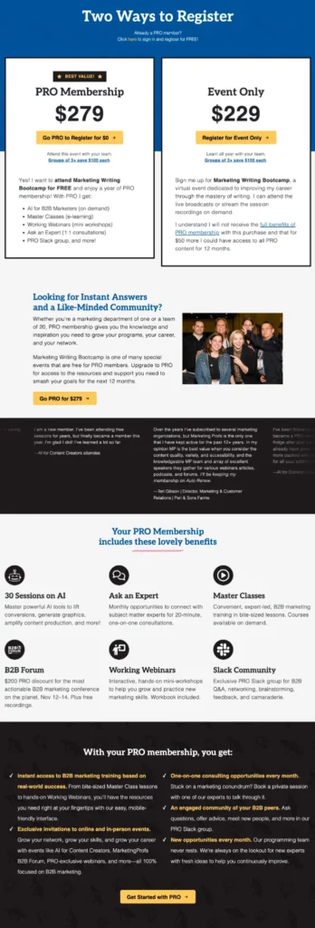
Sales landing page example (Source)
The anatomy of a landing page
Most landing pages follow the same design principles and include similar elements. Why?
For decades, users have developed scanning patterns for web pages. After browsing thousands of landing pages, your audience got used to a specific layout and has learned to quickly scan through content. Shuffling these elements can confuse users, make it difficult for them to focus on the page content, and lead to high bounce rates.
We’ll talk about the most common scanning patterns further in the article. Meanwhile, let's explore the must-have components of every landing page so you can create a familiar experience for your audience:
Header
Every landing page starts with an eye-catching header. This is where you communicate the essence of your offer without getting into too much detail.
The header of a landing page typically includes the following elements:
- A concise and compelling statement that grabs attention and communicates the primary benefit or offer.
- An eye-catching hero image.
- Additional context to elaborate on the headline.
- Minimal or no navigation links to keep visitors focused on the page's goal.
- A CTA that either drives users to the specific action or encourages them to explore the page content.
Oftentimes, headers on landing pages feature social proof, like client logos or customer testimonials. This is particularly common on sales-focused landing pages.
Landing page header (Source)
Supporting copy
Supporting copy is typically positioned below the headline or entire header section on a landing page. It offers additional details about the offering, including:
- Key features or unique selling points.
- Responses to common objections.
- Additional information about product or service uses and applications.
It’s best to complement your supporting copy with images or videos to illustrate your points and segment the text into several short sections for clarity.
Landing page copy (Source)
Compliant data collection form
Forms are integral components of lead capture and squeeze pages. Typically positioned below the header or next to brief supporting text, they may appear multiple times throughout the landing page, especially in longer formats.
When designing your form, keep it concise and collect only essential information. At the top of the marketing funnel, requesting minimal details like an email address and name will increase your campaign conversion rate. If you target a more qualified audience, you can ask for additional details like personal characteristics or company information.
Form example (Source)
Most importantly, all your forms should comply with relevant laws in the countries you’re targeting. In the EU, the GDPR is the main privacy and security law. It requires businesses to collect explicit consent from contacts before sending marketing communications.
To keep your forms compliant, always include a consent checkbox below your forms.
Related: Get inspired with the best newsletter signup examples.
CTA
The CTA button is a small yet critical part of every landing page. It's what encourages visitors to do something — like buy a product, download a guide, or sign up for an event.
Here are a few tips to create an effective CTA for your marketing landing pages:
- Your CTA should tell visitors exactly what you want them to do. For example, "Buy Now," "Download Your Free Guide," or "Join the Webinar."
- Make sure your CTA stands out on the page. Use bold colors and plenty of space around it.
- Use action words that push people to take the next step, like "Start," "Discover," or "Get."
- Display your CTA in multiple places on your landing page, not just at the end. You might put it after your headline, next to the form, and at the bottom of the page.
CTA example (Source)
Extra elements
Depending on your needs, you may want to include additional content on your landing page, such as:
- Social proof: Testimonials, client logos, or case studies to build trust with page visitors.
- Visual media: Images, videos, and icons to separate text and make the page more engaging.
- Trust badges: Security badges, certifications, or awards to demonstrate your reliability.
- Countdown timers: A widget to highlight limited-time offers or events and create urgency.
- FAQ section: Answers to common questions, typically displayed at the bottom of the page.
- Chat widget: Chatbot or live chat options to offer immediate support.
A typical sales page incorporates many of these elements, whereas a lead capture page might focus more on specific features like visual media or countdown timers.
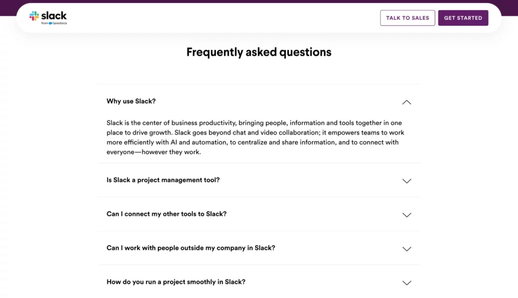
FAQ section example (Source)
Landing page best practices
Regardless of your objective, the formula for a successful landing page is straightforward. It doesn't need to be fancy or complex to grab visitors' attention and prompt them to take action. Quite the opposite — a sleek, simple design with clear content is the surefire way to achieve high conversions.
Stick to these best practices when creating your next landing page and never lose a conversion to poor design or unclear messaging:
Understand the major page scanning patterns
Users typically scan web pages in specific patterns. Knowing these patterns helps you place the most important elements where they will catch the user's attention.
The two most common scanning patterns are the "F-pattern" and the "Z-pattern."
- F-pattern: Users read the first few lines horizontally, then move down the page, scanning more selectively, creating an F-like shape. This is common for text-heavy pages.
- Z-pattern: Users scan across the top, down diagonally through the middle, and across the bottom. This pattern works well for pages with minimal text and a strong visual hierarchy.
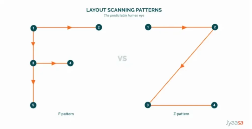
It’s best to stick to the F-pattern for pages where the goal is to convey detailed information like product descriptions or case studies. For squeeze and splash pages, the Z-pattern is more effective.
Related: 15 Email Design Best Practices
Know your goals
A common problem of many landing pages is not serving one clear objective. Many pages (especially sales pages) include as many as 2-3 CTAs, making it hard for a user to choose between those.
Say, you’re promoting a treadmill for home. Your main goal is to sell the treadmill (CTA #1), preferably at a target conversion rate of 5% per campaign. Your detailed landing page highlights the treadmill’s benefits, showcases positive reviews, and includes a video demonstrating its quiet operation.
But then, you also can’t help but include a link to a customer success story (CTA #2) sharing how using a treadmill has helped your customer improve their mobility. And to top it off, you encourage visitors to explore other tools on your website (CTA #3).
While those additional CTAs seem to increase the likelihood of conversion, they actually distract users from the target action.
If you feel the need to drive users to a separate page to give them more information about your offer, why not include this content right on the landing page? This way, you’ll be able to focus on one goal per campaign.
Choose the right landing page builder software
Now you know everything you need to create the best landing pages. The rest depends on whether your landing page builder software allows you to design a smooth user experience and seamlessly integrate it into your workflows.
How to choose the right one?
First, look at your existing tech stack. Do any of the marketing tools offer built-in landing page software?
For instance, if you use Brevo’s comprehensive marketing suite, it includes a drag-and-drop editor that lets you create forms and landing pages for any campaign. You can host your landing page on a Brevo subdomain or use your own.
The best part about using Brevo’s landing page builder is the seamless integration with other marketing tools. You can promote your landing page through email marketing campaigns, SMS, WhatsApp campaigns, Facebook Ads, and mobile and web push notifications, all within the same interface.
Building a new landing page in Brevo
How to create a landing page step-by-step with Brevo
Let's move from theory to practice and create your first landing page in Brevo together.
To build landing pages within Brevo’s all-in-one marketing suite, you need to be a user of the Business plan at only $18/month. See all the features available in the plan.
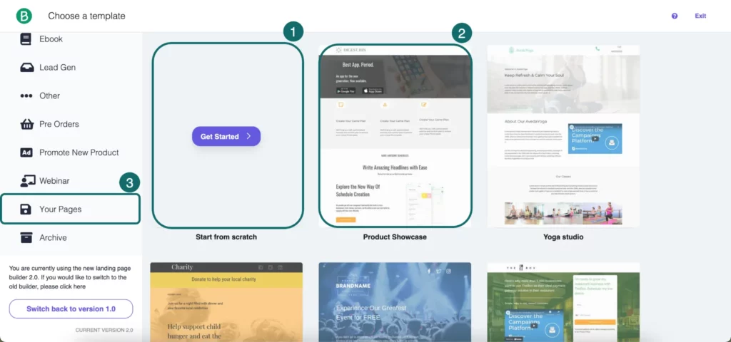
1. Choose a template or start from scratch
Navigate to the Contacts > Landing pages. Click Create a landing page and either start with a blank page to design from scratch (1), select a landing page template (2), or duplicate an existing page (3).
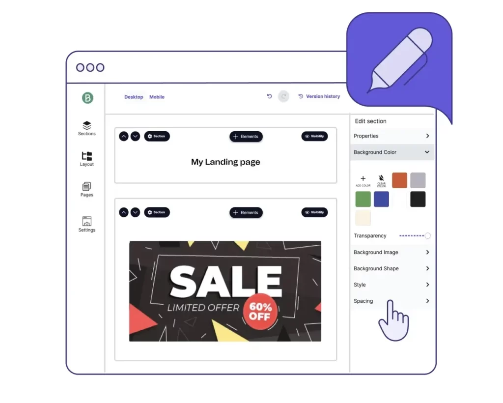
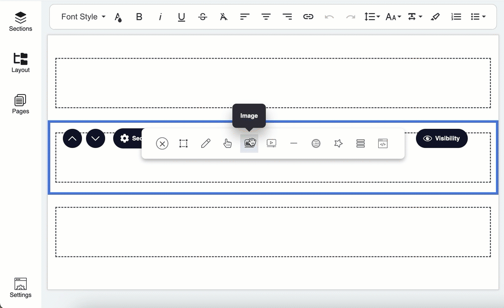
2. Customize your landing page with drag-and-drop elements
Once you’re in Brevo’s intuitive drag-and-drop editor, you can easily define the structure of your page and customize it with the following elements:
- Branded elements: choose your fonts, styles, logo, favicon, etc.
- Sections: create custom sections or choose from pre-made blocks such as header, cover, benefits, features, social proof, footer, forms, FAQs, etc.
- Visuals: upload images and videos.
- Buttons: customize the button text, style, and placement.
- Code: use a Code element to add custom HTML code snippets to your landing page.
3. Add a form if needed
You can create a form directly within the landing page builder. Just drag and drop the Form element to your page and configure it: choose where to store the data you collect, add and sort fields, make fields mandatory or not, add help text, etc.

Here, you can also enable the Double Opt-In setting to collect explicit consent from your subscribers.
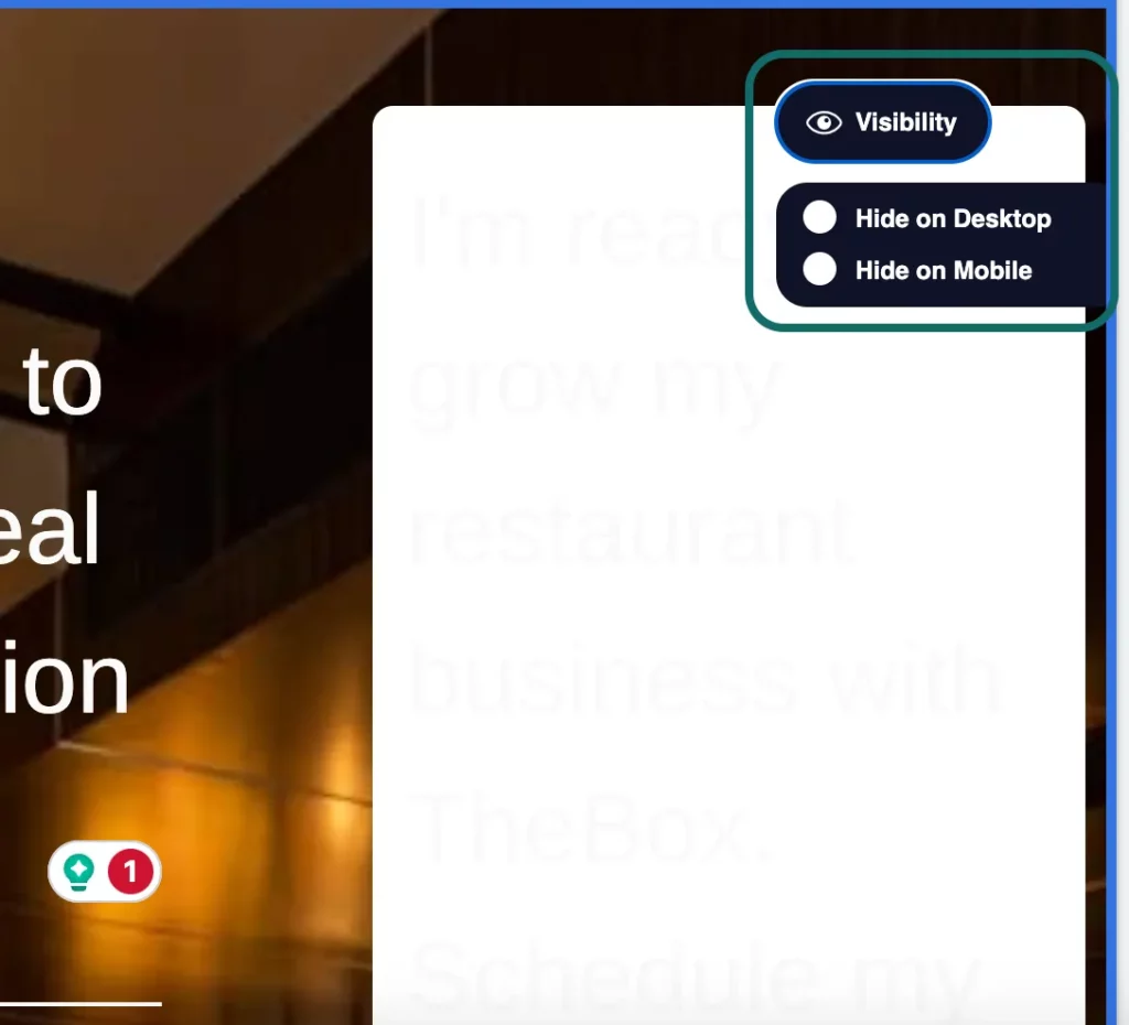
4. Optimize your page for mobile
Brevo lets you optimize your page for both desktop and mobile devices. Switch between the Desktop and Mobile options at the top of your landing page to see how it will look across different devices and optimize its appearance.
For instance, you can hide some elements or entire sections from mobile users to keep the page clean and readable on smaller screens.
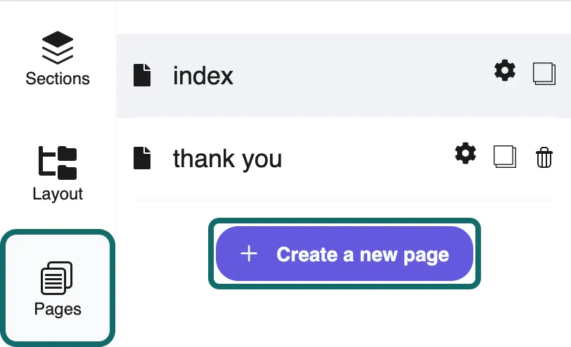
5. Create a multi-page funnel [Optional]
In Brevo, you have the option to create a multi-page funnel to guide your visitors through a series of steps toward conversion. This can be particularly effective when you want to move your potential customers from initial awareness about your business right to the buying decision.
To add sub-pages to your landing page, go to the Pages panel and click + Create a blank page. From there, you can design your sub-page from scratch.
6. Set up tracking
To add tracking scripts like Google Analytics, Facebook Pixel, or others to your landing page, navigate to Settings > Tracking. Paste your code into the appropriate tag field.
7. Save and publish your page
When all set, click Launch > Publish Now. Unless you buy a custom domain name, your landing page will be hosted on a Brevo subdomain.
You can either share the page by using the link provided by Brevo or embed it on an existing website by using an Iframe code snippet.
8. A/B test and optimize
How do you know your landing page performs at its best? It takes a lot of experimentation.
Create multiple versions of your landing page to identify what resonates best with your audience and boosts conversions. Here’s how to A/B test and optimize your landing page:
- Duplicate your existing landing page within Brevo and make specific changes to the variation you want to test (e.g., different headline, CTA button color, form fields).
- Split traffic between the original and the variation versions to compare their performance metrics.
- Monitor and analyze key metrics such as conversion rates, bounce rates, and engagement levels for each variant.
- Based on the results, implement the winning version across all your campaigns or make further changes that may increase your page’s conversion rates and continue testing.
Create landing pages that convert
A high-converting landing page stands on three pillars: knowing how your audience processes information, defining a clear objective, and using reliable software to bring your vision to fruition.
While you handle the first two pillars, Brevo takes care of the third one. With Brevo’s flexible and easy-to-use landing page builder, you can create great landing page designs and integrate them into your marketing campaigns.
Promote your landing pages through email newsletters, WhatsApp campaigns, and many other channels right in Brevo.