Transactional email design goes beyond aesthetics. It's about function, clarity, and delivering the right message at the right time.
Transactional emails play an important role in customer experience. With open rates of up to 85%, they give businesses a chance to communicate effectively with customers. But many miss the opportunity to make these emails work harder for them.
A good transactional email design highlights key details, reflects your brand, and keeps things clear for the customer.
Let’s look at some transactional email examples and actionable design tips to inspire you in your email marketing strategy.
What is a transactional email?
A transactional email is an automated email sent to a person based on a specific action they take on a website or app.
These emails are triggered by real-time user interactions and are intended to provide timely information or support related to that action, e.g. placing an order, requesting a password reset, etc.
Common types of transactional emails include:
- Order confirmation emails
- Abandoned cart emails
- Double opt-in emails
- Onboarding emails
- Welcome emails
- Password reset emails
- Subscription confirmation emails
- Notification emails
Often asked. What’s the difference between transactional and marketing emails?
Transactional emails are one-on-one. They’re sent after taking a specific action, like buying something, signing up, or needing a password reset. They’re sent just when you need them with specific details related to your activity. Transactional emails are often sent through an email API.
Marketing emails are one-to-many. They’re often promotional emails sent to a large email list with updates and offers to keep them engaged. Think email newsletters, sales promotions, event invites, etc
Unlike marketing emails, transactional emails are expected by the recipient. This expectation gives them higher open rates and engagement. Therefore, the design and content of these emails matter a lot because they shape user experience and trust.
Related: The best email API services compared.
Transactional email design examples and best practices
A well-thought-out transactional email design can do more than inform. It can create trust, improve customer experience, and even increase sales.
Whether you're in ecommerce, SaaS, or another industry, designing these emails with intention makes all the difference.
To get you started, here are examples, email design best practices, and industry-specific tips to help you create effective transactional emails.
1. Keep it clean and simple
A minimalist transactional email design makes sure your email is easy to read and keeps focus on the key message.
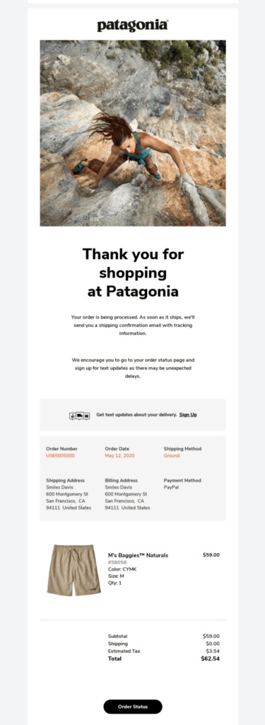
Example. Patagonia’s order confirmation email uses a clean layout with plenty of white space, bold fonts for key details, and subtle brand colors. This design makes it easy for the recipient to quickly find the most important information, such as their order details and delivery date.
Best practice
- Stick to a single-column layout to maintain clarity.
- Use white space strategically to separate sections.
- Highlight key information, such as order numbers, with bold or larger fonts.
Pro tip. For ecommerce brands, simplify post-purchase emails to reduce confusion. A clean design reassures customers that their order is confirmed and provides them with clear next steps.
2. Have a clear call to action (CTA)
Transactional emails often ask users to complete an action. Make sure it’s clear and easy to follow.
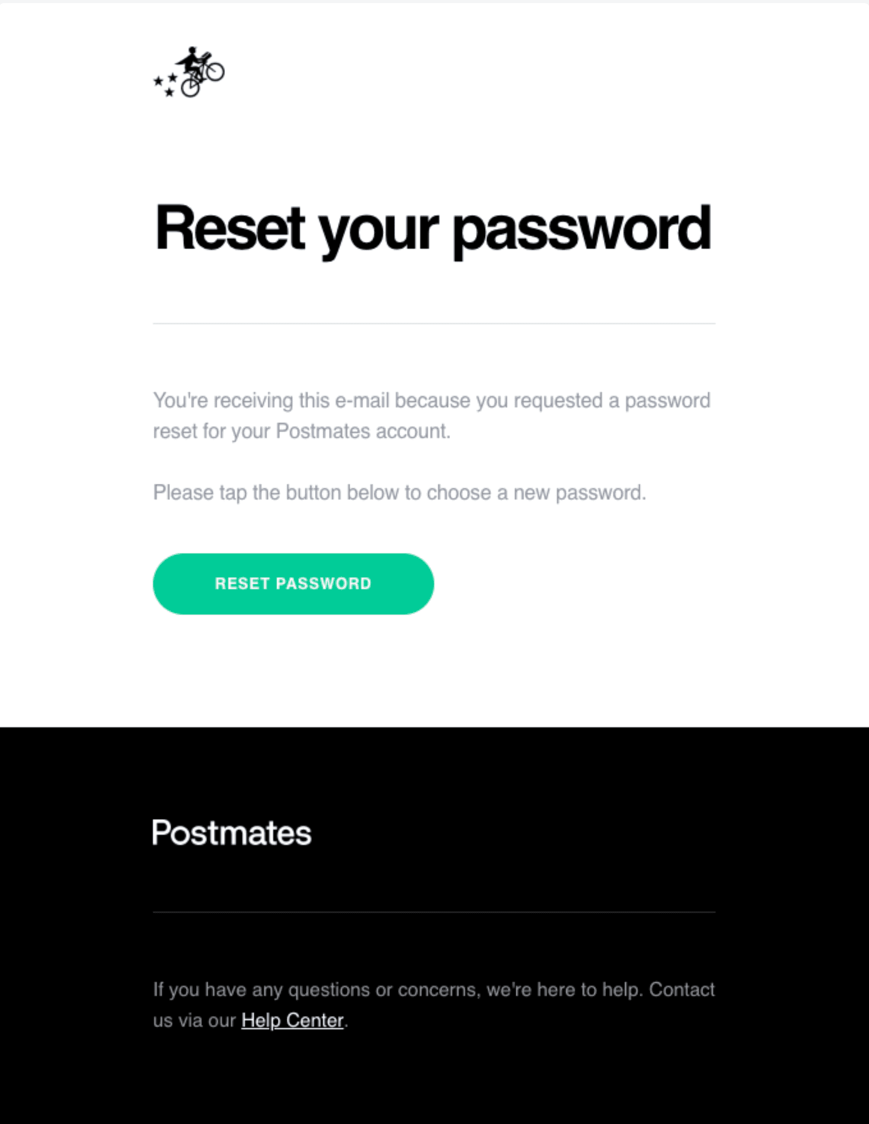
Example. Postmates’ password reset email includes a brightly colored CTA button that stands out against the background and simple instructions. The placement ensures subscribers can locate it at a glance.
Best practice
- Use contrasting colors to make the CTA button pop.
- Keep the CTA text action-oriented and concise, such as “Reset Password” or “Track Your Order.”
- Place the CTA prominently, ideally above the fold.
Pro tip. For SaaS companies, use welcome emails to guide new users. Include clear CTAs like “Start Your Tutorial” or “Set Up Your Profile” to drive first engagement with your platform.
3. Stand out with bright colors
Using bold colors and fun graphics makes your transactional emails more memorable and strengthens your brand identity.
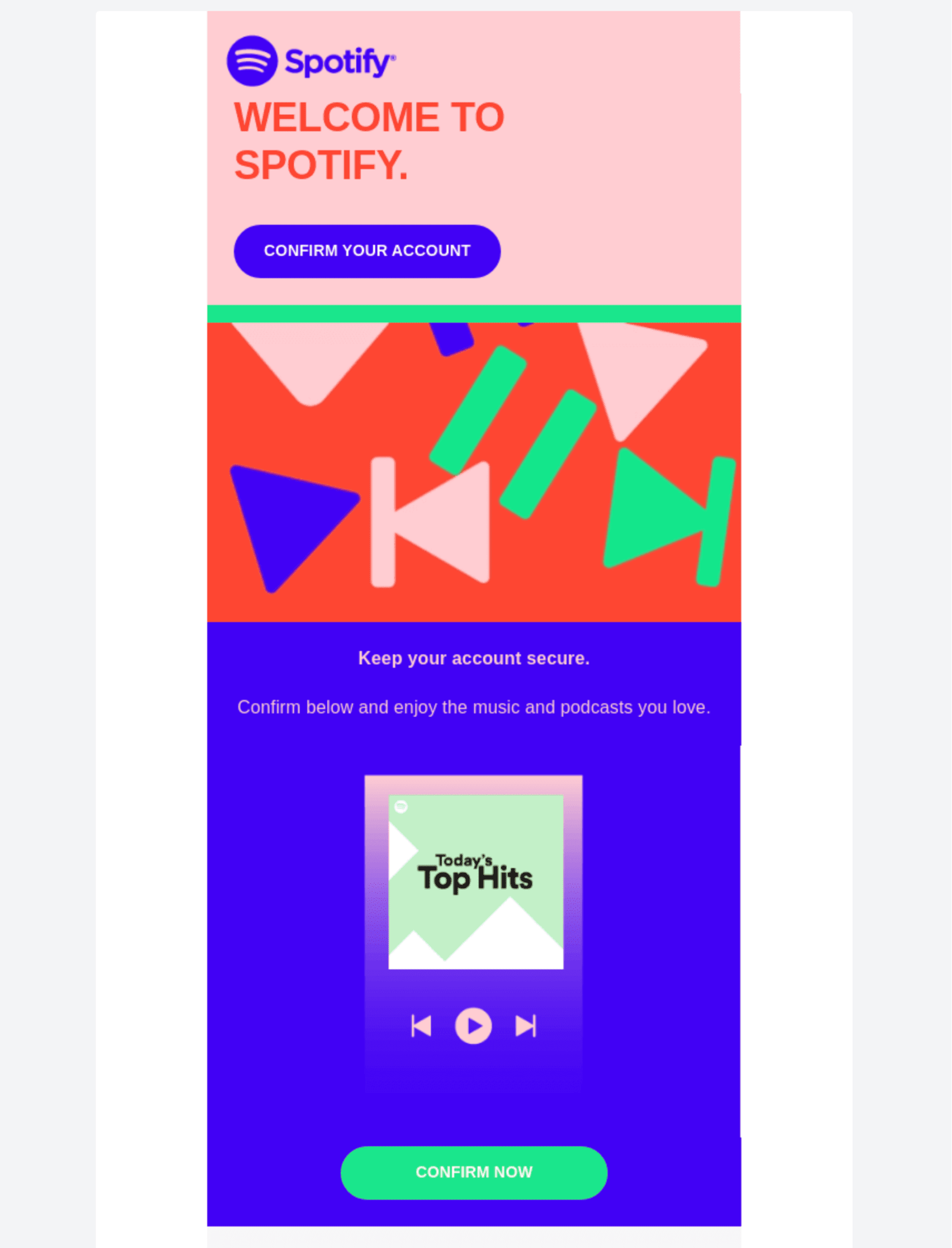
Example. Spotify’s account confirmation email uses playful graphics and a bold green CTA button that fits right in with their brand colors. The bright colors immediately pull the reader’s attention to the main action — confirming their account.
Best practice
- Use colors that complement your brand identity.
- Keep the color palette simple to avoid overwhelming readers.
- Reserve bright colors for CTAs and important highlights.
Pro tip. Bright colors work especially well for consumer-facing brands like retail or entertainment, where a visually exciting email design can grab attention and increase engagement.
4. Use graphic images
Visual elements like app screenshots or icons can complement your email message, guiding users effectively and giving them further context.
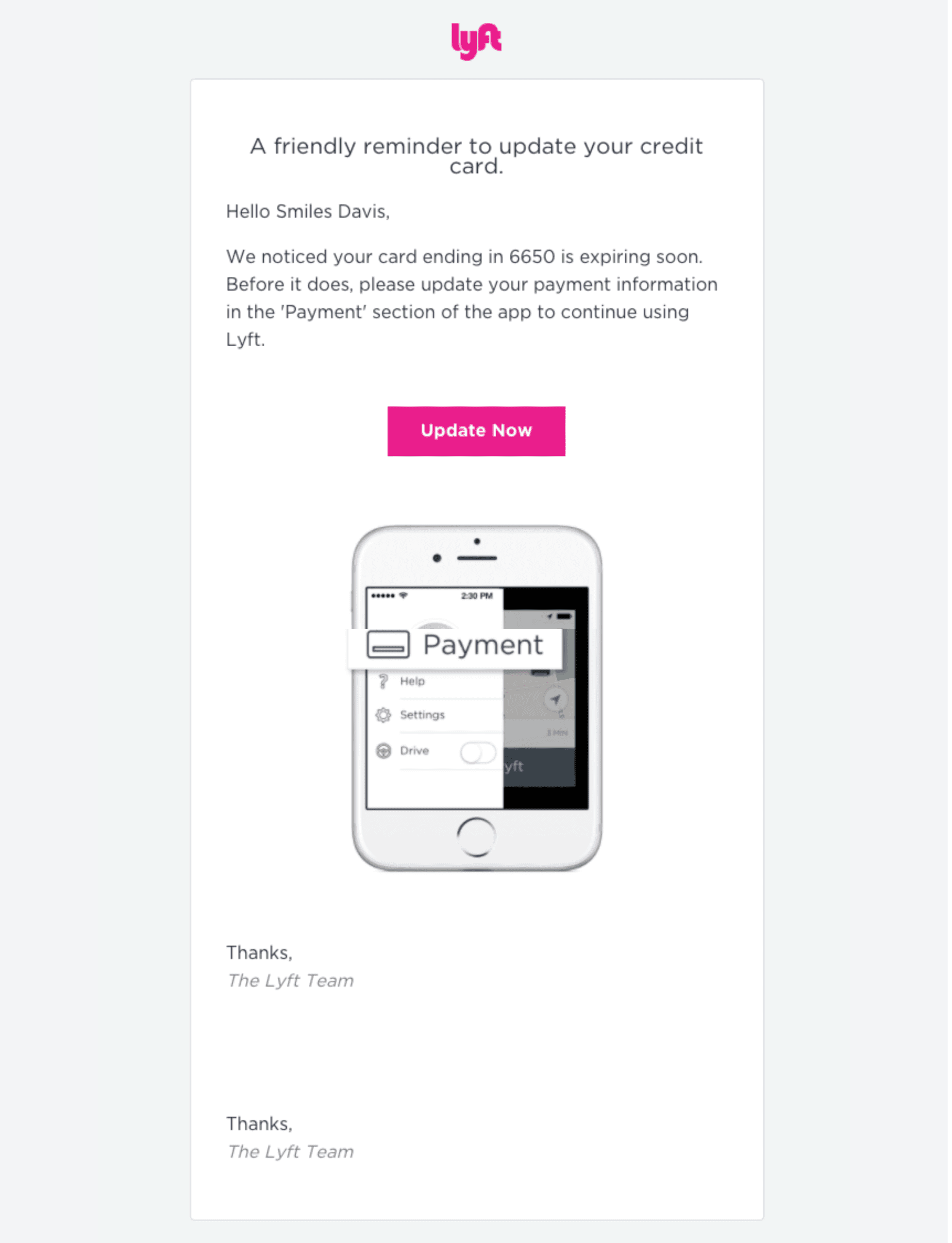
Example. Lyft’s payment update reminder uses an app screenshot to show exactly where users need to enter their credit card details. This reduces confusion and helps users act quickly.
Best practice
- Use images to explain complex actions or highlight key features.
- Avoid unnecessary visuals that don’t add value to the message.
- Optimize images for mobile to maintain a fast loading time.
Pro tip. For ecommerce, include product images in shipping confirmation/updates to keep customers excited about their purchases.
5. Add a human touch
Humanizing your transactional emails can make them feel more personal and relatable.
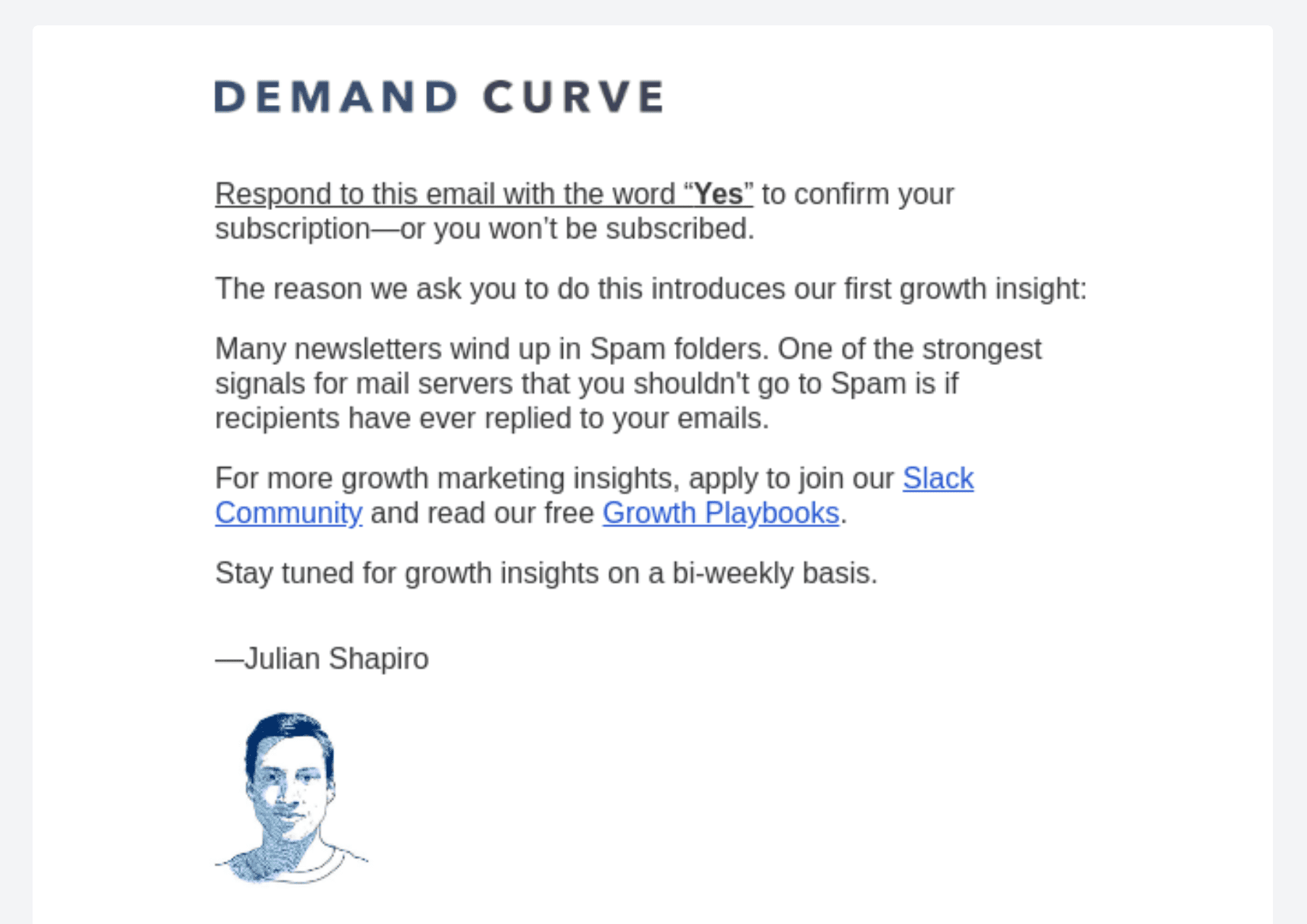
Example. Demand Curve’s subscription confirmation email is signed by a team member, giving the message a friendly and approachable tone.
Best practice
- Include a sender name rather than a generic email address.
- Use conversational language that matches your brand tone.
- Sign off from a real person or team to add authenticity.
Pro tip. In service-based industries, humanizing emails can build trust. For example, a welcome email signed by a support team member reassures customers that help is always available.
6. Flex your brand voice
Transactional emails don’t have to be stiff or robotic. Let your brand’s personality shine. Keep your email copy clear and to the point, but add a touch of your brand’s unique voice.
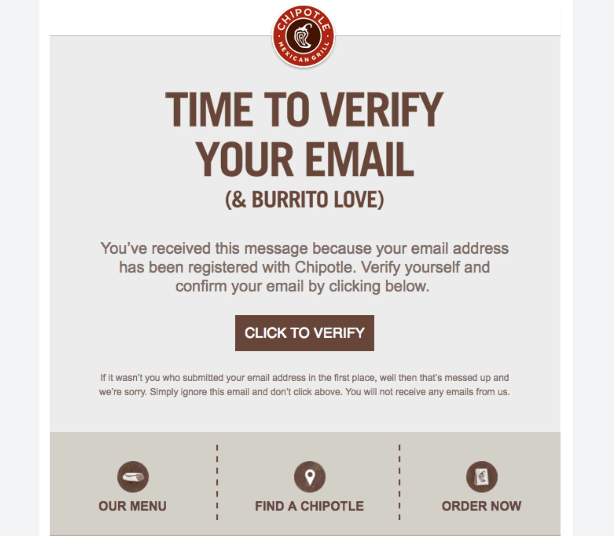
Example. Chipotle’s email confirmation playfully says, “Confirm your love for burritos.” This small touch ties the action to the brand’s identity.
Best practice
- Write in a tone consistent with your brand’s personality.
- Keep the message clear while adding humor or friendliness where appropriate.
- Use language that resonates with your audience.
Pro tip. For hospitality or entertainment brands, playful language can improve the customer experience and make your emails more memorable.
7. Avoid jargon
To connect with customers, avoid jargon in your transactional emails. Use a conversational tone in the email content. That will help make your transactional email messages easy for customers to digest.
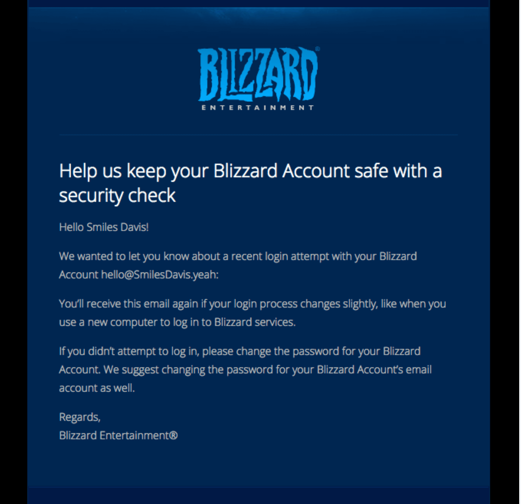
Example. Blizzard’s security check email keeps the language simple and easy to follow, avoiding technical terms that might confuse users.
Best practice
- Write at a reading level that matches your audience.
- Avoid acronyms or technical language unless absolutely necessary.
- Use concise sentences and bullet points for clarity.
Pro tip. For tech companies, focus on clear instructions without assuming technical knowledge.
8. Ask for feedback
Transactional emails are a great way to gather customer feedback and learn more about them.
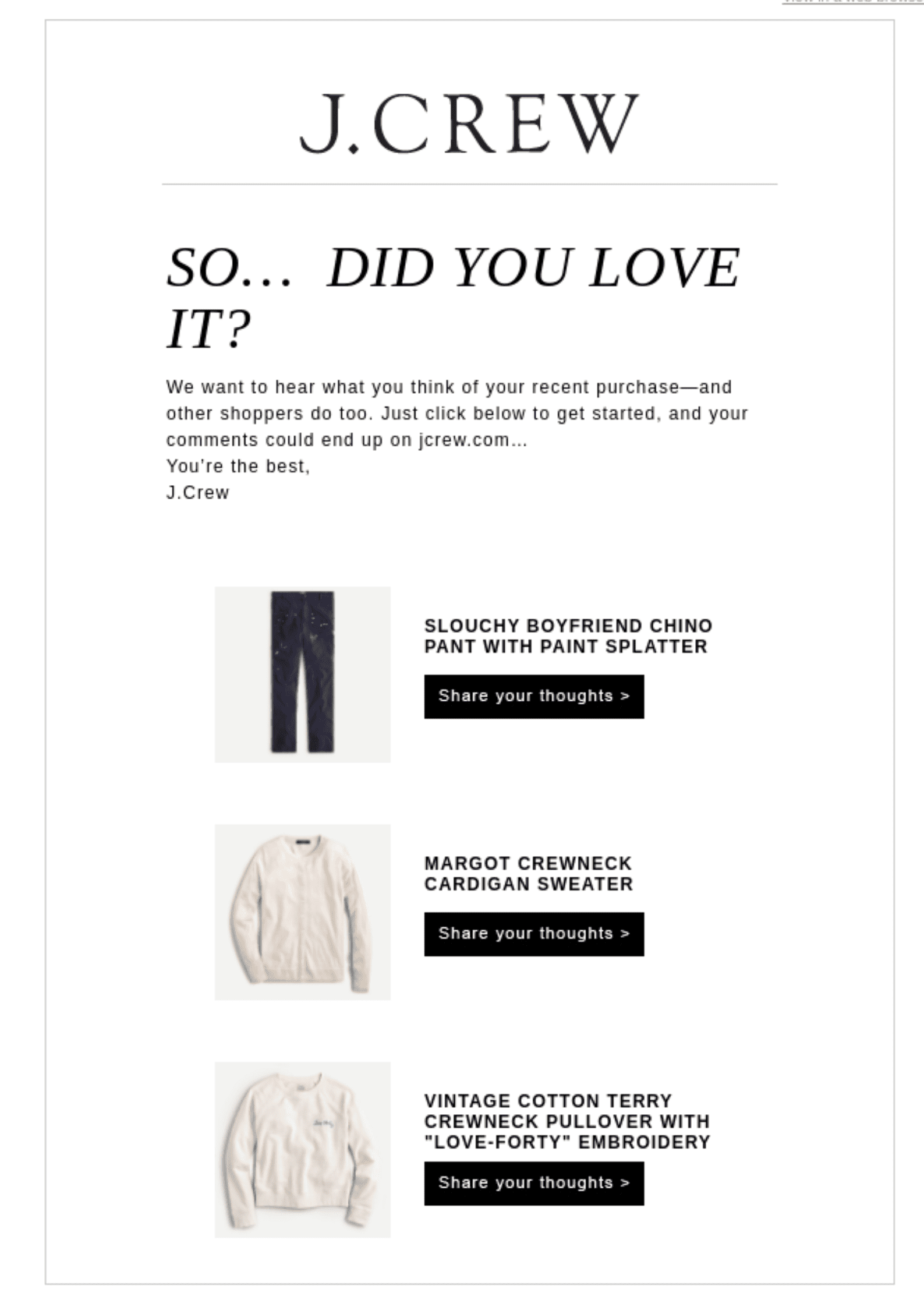
Example. J.Crew’s feedback email highlights purchased products alongside quick buttons for reviews, making it easy for customers to share their thoughts.
Best practice
- Personalize feedback requests based on recent activity.
- Make it effortless by including one-click options for feedback.
- Follow up with a thank-you message to show appreciation.
Pro tip. For hospitality brands, asking for feedback after a stay or service can help improve your offerings while showing customers you value their input.
9. Drive conversions
Depending on the type of email, transactional messages can help drive conversions. Use them as opportunities to upsell or cross-sell different products.
You can also send transactional emails to get subscribers to resubscribe. If you offer free subscriptions, convince customers to upgrade to a paid plan.
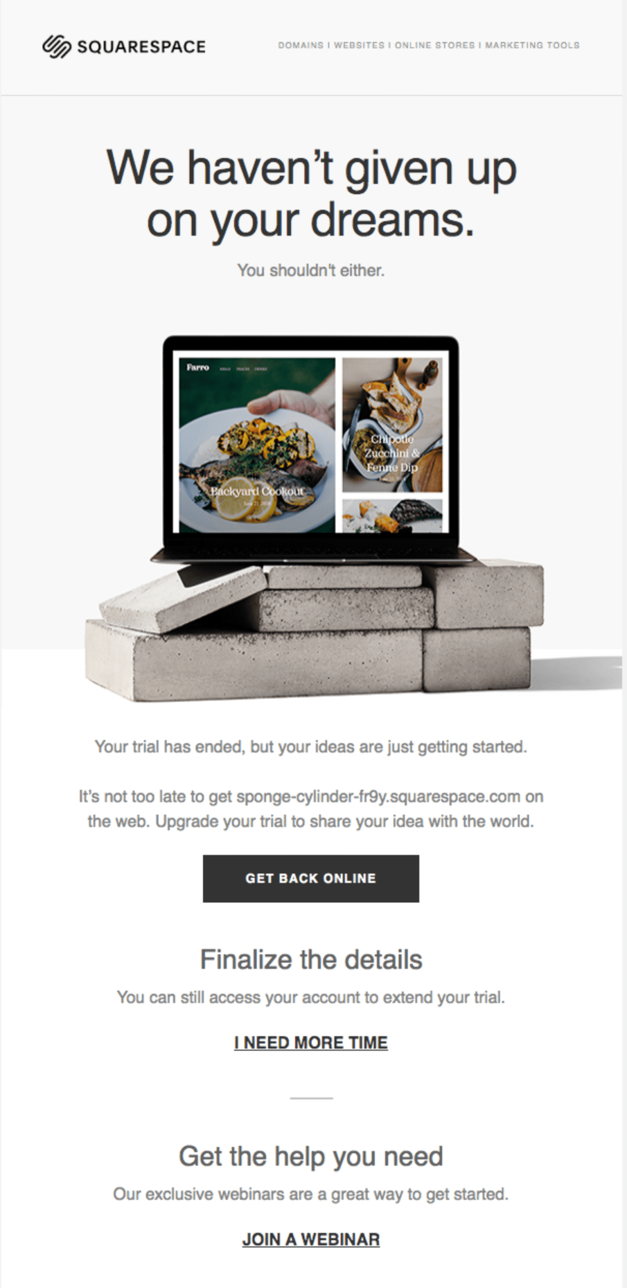
Example. Squarespace’s free trial expiration email promotes a paid subscription by highlighting premium features and including a clear CTA to upgrade.
Best practice
- Include relevant product suggestions or upgrade offers.
- Make sure promotional content doesn’t overshadow the main purpose of the email.
- Use urgency sparingly, such as a limited-time offer for an upgrade.
Pro tip. For ecommerce brands, include recommendations for complementary products in order confirmation emails. Amazon does this well.
Bonus tips for designing effective transactional emails
As you put these design tips into practice, here are a few final pointers to make sure your transactional emails are as effective as possible.
- Optimize for mobile. Over 60% of emails are opened on mobile devices, so make sure your design is responsive and mobile-friendly.
- Test your emails. A/B test subject lines, CTAs, and designs to know what resonates best with your audience.
- Include a fallback option. In case a button or link doesn’t work, provide a simple alternative like a URL that can be copied and pasted. This way, the user can still take action even if there’s a technical issue, creating a smoother, frustration-free experience.
Start your transactional email design with Brevo
Transactional email service providers make it easy to send transactional emails. With Brevo you can design transactional email messages that feel like part of your brand — clear, polished, and personal.
You can:
Drag and drop your way to a professional email, or choose from 40+ responsive email templates for order confirmations, welcome emails and more.
Make each email your own by customizing Brevo’s transactional email templates with your brand’s colors, logo, and fonts — or go deeper with HTML if that’s more your style.
Send your transactional emails through Brevo's free SMTP server, and enjoy key features like reliable deliverability, GDPR compliance, and detailed analytics.