
Ever wonder why some brands' popups seem to work so well while others fall flat?
When done right, a popup can capture attention, deliver value, and turn casual visitors into loyal subscribers — all in a matter of seconds. But when done wrong, it risks driving people away, tanking your conversion rates, and leaving money on the table.
In this guide, we’ll break down exactly what makes a successful email popup. You’ll learn the best practices that high-converting popups follow and see real-world email popup examples — from brands that nail it to those that miss the mark. By the end, you’ll know how to craft popups that not only stand out but also drive real results.
Ready to transform your email popups into powerful lead-generation tools? Let’s get started!
Table of contents
Blueprint for high-converting email popups: 7 best practices
Before we dive into the real-world email popup examples, let’s start with the fundamentals.
If your popups aren’t delivering the results you want, not to worry. Implementing these proven strategies can turn things around fast.
1. Magnetic offers that convert
You’ve got just a moment to grab a visitor’s attention — so make it count.
The secret? A lead magnet so good it feels like a total win for them.
“Wait, I get an amazing freebie, and all I have to do is share my email? I’m in!”
That’s exactly the reaction you want.
Since the lead magnet is the cornerstone of your popup’s success, it’s worth putting in the time and effort to nail it. When your offer delivers exceptional value, you can commit cardinal sins elsewhere in your popup design and you’ll still drive some conversions.
High-converting offer ideas include:
- For ecommerce stores: Discounts, coupon codes, special offers, free shipping, or free gifts.
- For content-based businesses: Free ebooks, exclusive content or webinars, bite-sized daily lessons.
- For service-based companies: Free trials, consultations, or assessments.
The stronger the offer, the easier the conversions come. Get this right, and you’re already halfway to success.
2. Clear messaging, instant impact
Once your offer is on point, your next move is to make your message crystal clear.
Visitors should know exactly what they’re getting — no guesswork, no mental gymnastics. A quick scan, and they’re sold.
For example:
"Sign up and get a free 50-page ebook on building a timeless wardrobe."
It’s simple and straightforward: Hand over your email, get your free ebook. No fluff, no ambiguity, no confusion.
The very best popups combine a strong offer with a clear message. Get both right, and your sign-ups won’t just increase—they’ll skyrocket.
3. CTAs that demand clicks
You’ve got a killer offer and fine-tuned your message—now what?
It’s time to turn that interest into action. Your call-to-action (CTA) is the magic button that seals the deal.
The best CTAs absolutely pop.
Use contrasting colors to grab more attention, but don’t worry about which color is “best”—it’s just a myth that green always wins. The truth? What really matters is visibility.
But it’s not just about looks. The language of your CTA needs to drive action, too.
Imagine you’re offering a free ebook. Which sounds better?
“Download” vs. “Get my free book NOW”
You don’t need a rocket scientist to know the second option wins. It’s action-oriented, adds a dash of urgency, and feels way more exciting.
When your CTA shines, and your proposition is clear, clicking becomes a no-brainer for visitors.
4. Design for everyone
It should go without saying, but your website popups need to look good everywhere. Desktop, tablet, mobile — your design should impress on any screen.
Of course, “looking good” is subjective. Some popups thrive with a minimalist design, while others excel by being bold and unapologetically loud. The trick is to match your brand’s vibe and execute it well.
Not much of a designer? My advice: keep it simple. Subtle colors, clean fonts, and clear text — let your lead magnet and message do the heavy lifting. Many platforms offer email capture popup templates to get you up and running.
And whatever you do, don’t forget about mobile visitors. Your website needs to look sharp across all devices, and your popup designs do, too. Trust me, your visitors will thank you — and so will Google.
5. Perfect timing, maximum conversions
A popup appearing the moment a visitor lands? Bad idea.
Sure, showing your offer to as many people as possible sounds smart. But when someone’s just arrived, hitting them with an instant popup isn’t effective — it’s just annoying.
“Why are you trying to sell me something before I even know if I like your site?”
Instead of capturing leads, you’ll just boost your bounce rate as visitors scramble for the back button.
So, when’s the right time?
Time delays (like 30 seconds in) or scroll triggers (when a visitor has scrolled 60% of the page) are great options. If someone sticks around that long, they probably like what they see. And when only the most engaged users see your popup, conversion rates shoot up.
Exit-intent popup windows are a smart move, too. These popups appear when a visitor’s cursor drifts toward the back button. There’s nothing to lose at this point. Most users won’t return anyway, so why not take a last-ditch shot at turning them into email subscribers?
For a more advanced approach, some popup builders allow ultra-specific trigger settings. If your site covers three topics with unique giveaways for each, you can display targeted popups based on the page a visitor is browsing. This kind of tailored strategy is a proven way to boost results. It's like audience segmentation, but for popups.
6. Fewer fields, more sign-ups
If there’s one golden rule for high-converting popups: Simplicity is king.
You want visitors to digest your message instantly and sign up with zero friction. That means trimming down the number of fields in your popup to the bare minimum.
Every extra field is another hoop to jump through — one more reason for visitors to bounce.
“Why do they need my name? Do I really want to fill this out?”
The best popups typically want just one thing: to collect email addresses. Unless you’ve got a rock-solid reason to ask for more, why overcomplicate it? Keep the fields to a minimum and only ask for a visitor’s email address.
Fewer barriers, more conversions. It’s as simple as that.
7. Test and tweak: Rinse and repeat
The final tip for high-converting popups? Test, test, and test again.
Even if your popup is performing brilliantly, don’t get too comfortable. There’s always room for improvement.
Most popup builders offer A/B testing, a simple yet powerful tool that lets you pit two versions of your popup against each other to see which one comes out on top.
The trick is to test one specific variable at a time. Maybe start with your CTA button. Does red convert better than green?
If red wins after a meaningful sample size, ditch the green and move on to your next experiment. You could try a bigger button, tweak your popup copy, or add a dash of urgency to your copy, to find more ways to make your popup work better.
Continuous optimization isn’t just a marketing buzzword — it’s a strategy. The best marketers never settle, and neither should you.
Continuous optimization is a key part of the master marketer’s playbook. Never rest on your laurels; make it part of yours, too.
20 email popup examples: What works and what doesn’t
Now that we’ve covered the fundamentals, let’s dive into the real-world popups. In this section, we’ll analyze 20 email popup examples from major brands — some well-executed, others less so.
No popup is perfect, but by comparing these examples against our popup best practices, we’ll uncover what drives conversions and where there’s room for improvement.
1. Kiehl’s
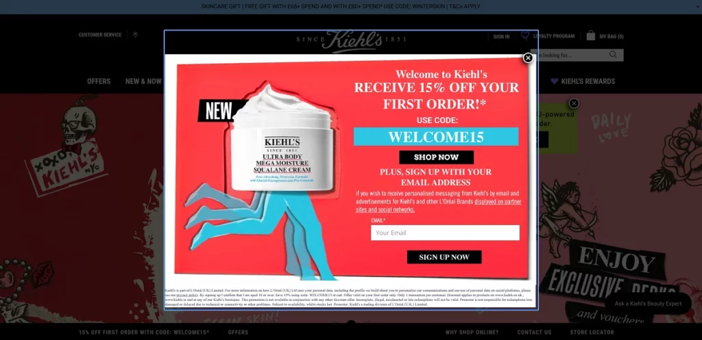
Kiehl’s nails it with bright colors, eye-catching visuals, and a hero image showcases a bestselling product.
What sets this popup apart is its straightforward value. The discount code comes with no strings attached — no forced sign-up, no sneaky data grab. Visitors get a genuine perk, and subscribing via email is optional, not obligatory. It feels like a gift, not a transaction, which builds trust and boosts conversion.
2. Mankind
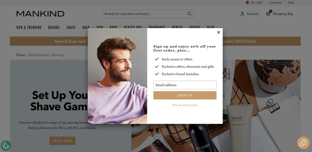
Mankind is a great email popup example, keeping it simple but effective.
The popup’s design blends seamlessly with the brand’s aesthetic, creating a smooth, cohesive experience. The offer is strong — new subscribers get generous discounts, exclusive promos, and early access to new products. These incentives are enough to drive sign-ups without over-the-top tactics.
3. P&O Cruises
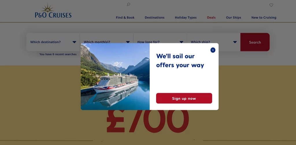
P&O Cruises’ popup looks sharp, but it misses the mark where it matters.
The offer feels vague — mentioning discounts without specifics leaves visitors unsure of the value. The CTA button leads to a long form with vague promises of “fantastic offers, adding friction to the process. Instead of a quick win, users face extra steps and uncertainty, which can hurt conversions.
4. Copyblogger
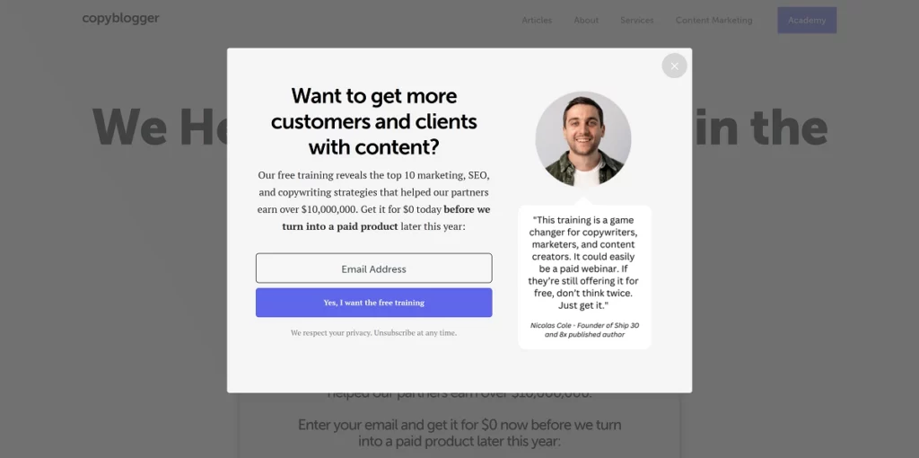
Copyblogger shows how it’s done, hitting nearly every popup best practice.
The “Free training” offer screams value, backed by a bold claim of helping partners earn “over $10,000,000.” Adding urgency with “turning into a paid product next year” is a smart move, and the expert testimonial strengthens social proof. The CTA button isn’t just functional — it’s persuasive, emphasizing benefits rather than a generic “Sign Up.”
5. Grenade
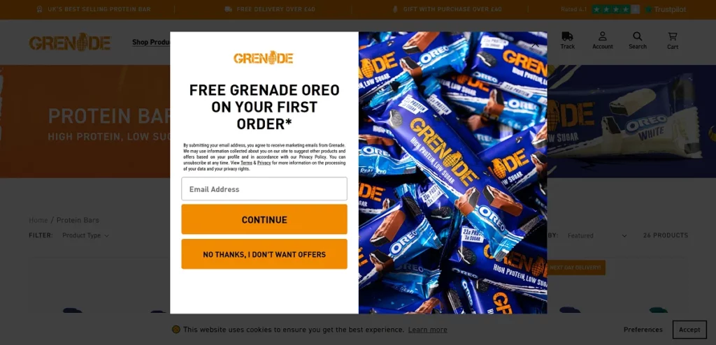
Grenade's popup is bold and brand-aligned, with vibrant brand colors and a compelling product image. It’s one of the better email popup examples.
The offer — a free box of protein bars — is a no-brainer for fitness fans. A clever twist is the decline button, which says, “I don’t like offers.” This subtle psychological nudge makes it harder to reject the offer and boosting conversion rates.
6. Fender
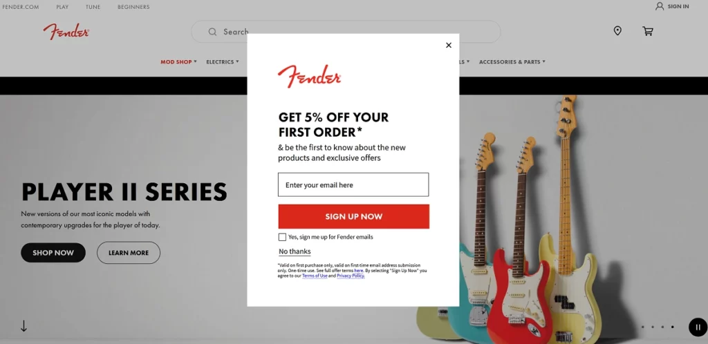
Fender’s popup is simple but effective.
A 5% discount for first-time buyers might not seem huge, but on big-ticket items like guitars, it’s a solid incentive. The real win here is choice: users can opt in for marketing emails or skip it entirely. This sense of control reduces resistance and encourages more sign-ups.
7. Gibson
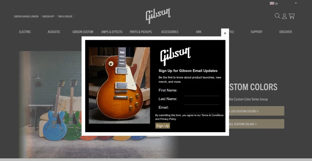
Now, let’s compare Fender’s popup to that of its long-time rival, Gibson.
Gibson’s popup looks good but stumbles in execution.
Unlike Fender’s quick and easy form, Gibson’s popup demands three fields. This adds friction and slowing users down. Worse, there’s no clear incentive — no discount, no irresistible offer. The result? A higher chance of visitors bouncing instead of converting.
8. Filofax
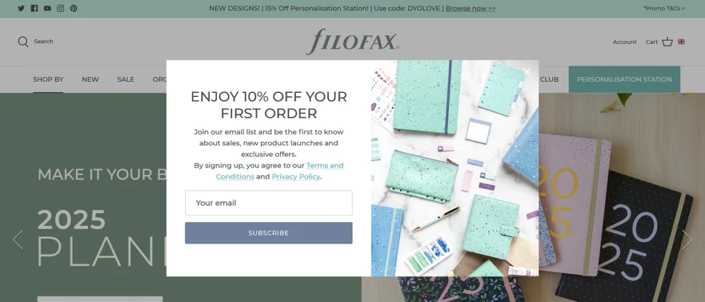
Filofax keeps it clean and on-brand with a beautifully simple popup.
The message is clear and direct — no clutter, no distractions. By focusing on a strong, straightforward value proposition, Filofax proves that sometimes, simplicity is the smartest strategy.
9. OptinMonster
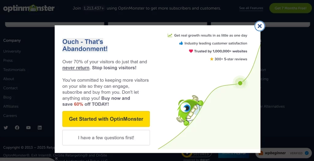
OptinMonster, a popup software pro, shows off its expertise with a strong example.
The lightbox popup boasts powerful social proof (“trusted by 1,000,000+ websites”) and leverages statistics to build credibility. The 60% discount offer is a huge draw, giving users a clear and compelling reason to sign up. As an industry specialist, this is almost a textbook email popup example.
10. Kindlepreneur
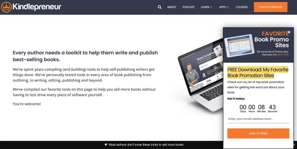
Kindlepreneur's popup is subtle but effective.
An interactive countdown timer adds urgency, pushing visitors to act fast. The offer is perfectly tailored — helping authors market and sell more books, a direct solution to a key pain point. It’s a smart, targeted approach that likely drives impressive conversions.
11. Huel
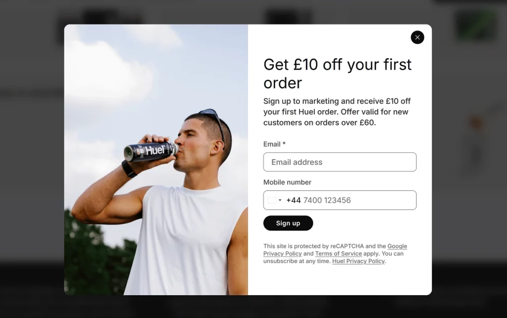
Huel’s popup is clean, simple, and straight to the point.
However, the optional mobile number field could be a barrier. Many visitors hesitate to share personal info without a compelling reason. Unless there’s a clear benefit (like SMS-only offers), it’s better to avoid asking for phone numbers to keep sign-ups friction-free.
12. Jellycat
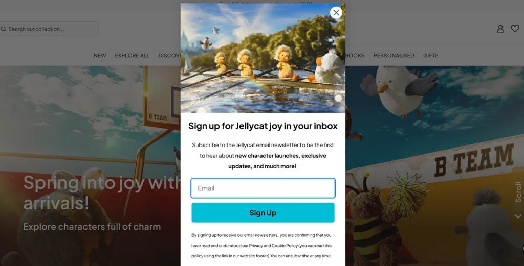
Jellycat’s popup is playful and on-brand but lacks a real incentive.
Without a discount, freebie, or exclusive perk, the popup relies solely on brand loyalty to drive sign-ups. While this might work for superfans, a stronger offer could attract a broader audience.
13. Pret
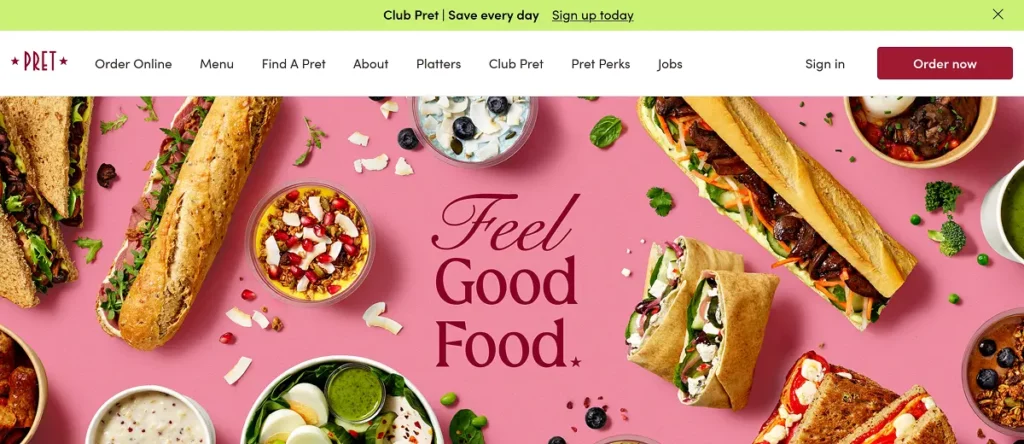
Pret opts for a subtle approach with a small popup bar at the top of the screen.
For new visitors, it’s easy to miss, but that’s the point. It offers value without interrupting the browsing experience. This gentle strategy maintains a smooth user experience, even if it sacrifices some visibility.
14. Apple TV+
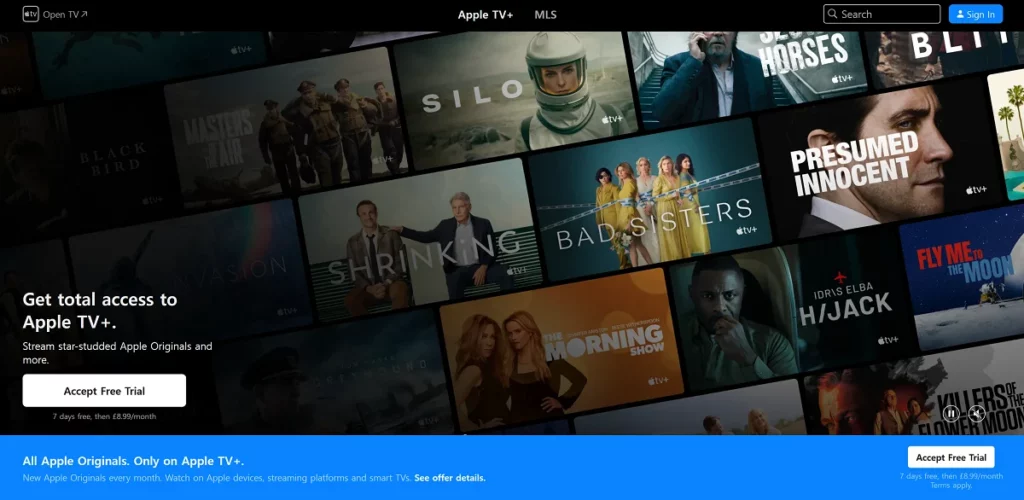
Apple TV+ uses a sticky bottom bar for its popup — smart and effective.
The bar remains visible as visitors scroll, keeping the message in sight without disrupting the experience. This balance of visibility and subtlety encourages sign-ups without annoying users.
15. Reiss
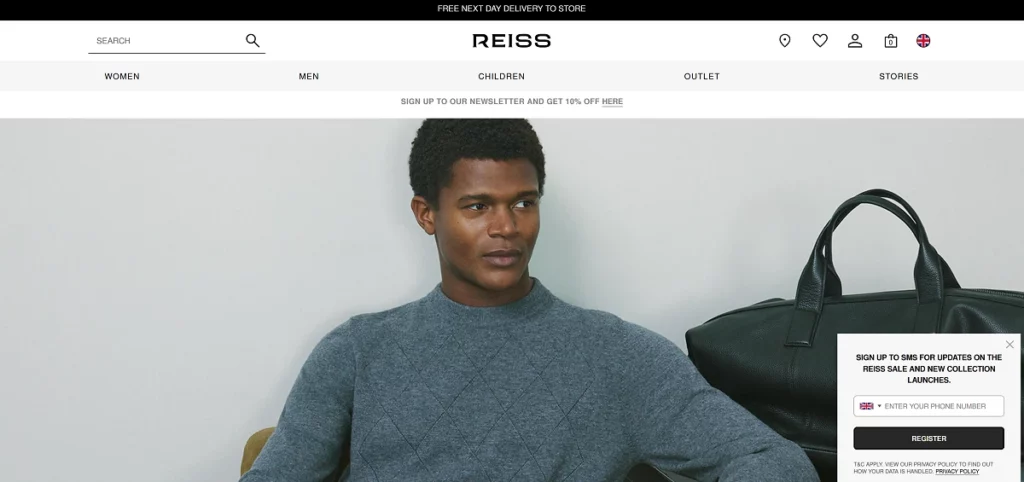
UK fashion retailer Reiss uses a small slide-in popup form — visible yet not too pushy.
However, it falls into a common trap: asking for a phone number instead of an email. This higher commitment level might scare off potential subscribers. Keeping it simple with just an email field could boost email signups.
16. Giant
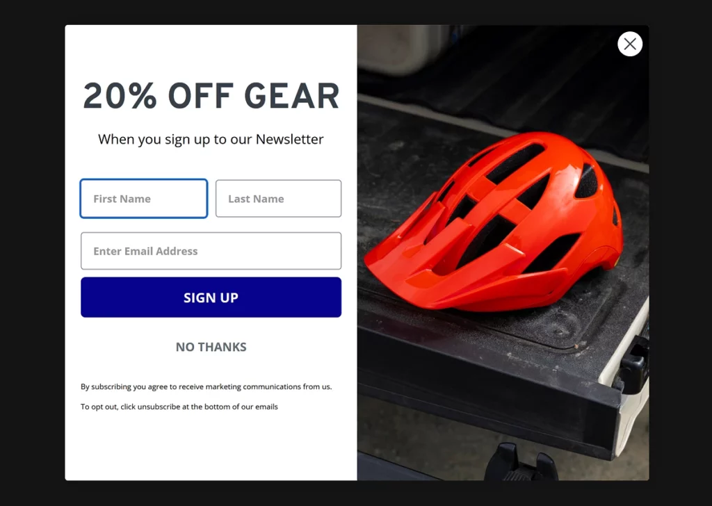
Giant Bicycles gets a lot right — clean design, relevant image, strong 20% discount.
But the form asks for too much information. Requiring both first and last names is unnecessary. The simpler the form, the higher the sign-up rate. Making extra fields optional or removing them altogether would help. It’s nearly there, but a few tweaks would make it a better email popup example.
17. SmartBlogger
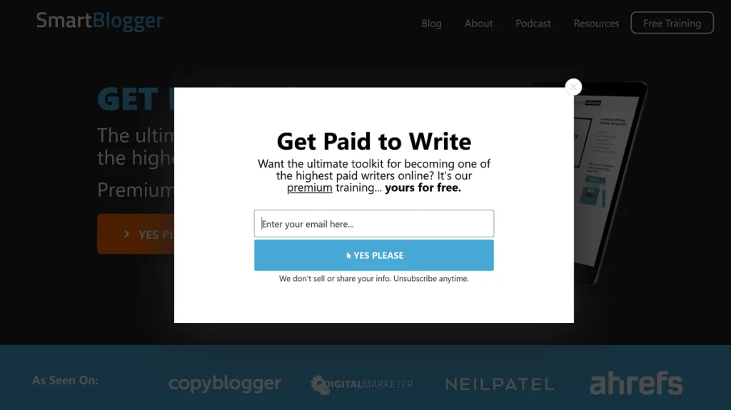
SmartBlogger’s popup hits all the right notes.
The offer is pitch-perfect for its target audience. “Get paid to write” is a powerful draw for aspiring writers. The free premium training course adds extra appeal, especially in a niche where education often comes with a hefty price tag. This sets them up well for a successful email marketing campaign.
18. Neil Patel
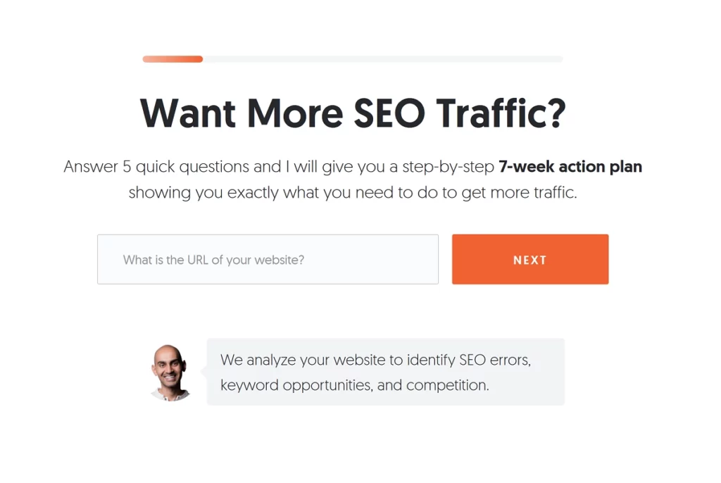
Neil Patel takes a bold approach with a fullscreen popup on his landing page — a super imposing type of popup. Additionally, it features a progress bar, signaling that it’s a multi-step signup form and requires a significant time investment from potential subscribers. The form even asks for relatively personal information, like a webpage URL, which may turn casual visitors away.
This goes against all of our best practices, so what gives?
While this approach might reduce the total sign-ups, it likely boosts the quality of leads. Asking for detailed information like a webpage URL helps filter out casual visitors, ensuring those who complete the form are genuinely interested and more likely to convert. In this case, quality over quantity is the key marketing strategy.
19. Levi’s
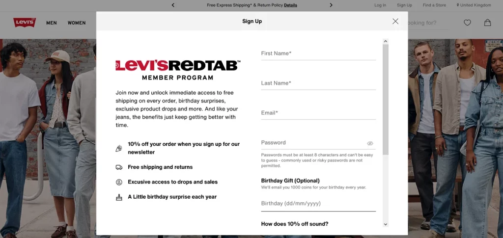
Levi’s popup overcomplicates things, asking for too much information upfront from website visitors.
The five-field form, including full name, birthdate, and a password, feels excessive. The more effort required, the fewer people will complete it. Simplifying the form would likely boost conversions.
20. MyProtein
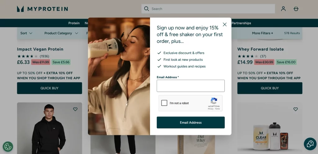
Finally, MyProtein’s popup is simple and effective, hitting all the key points.
The strong offer, relevant image, and clear messaging make it a winner. However, the reCAPTCHA might hurt sign-ups. While it helps block bots, it’s also a nuisance for real users. Many email marketing platforms, including Brevo, already handle spam well, so it might not be necessary. There’s just no need to risk turning away real customers just to prevent a few bots.
Related: 20 Newsletter Signup Examples to Take Inspiration From
Email popup examples: Conclusion
The difference between a popup that converts and one that falls flat often comes down to the details. Sometimes, minor tweaks can lead to big wins. But stick to the best practices — a compelling offer, clear messaging, a strong call-to-action, and thoughtful design — and your email list will grow faster than ever.
Remember, optimization is never a set-and-forget deal. Consistently refine your approach and never settle for “good enough” — unless you’re okay with leaving money on the table. Take inspiration from the email popup examples we’ve explored today and apply these lessons to your own strategy.
Ready to put these insights into action? It’s time to build popups that don’t just grab attention — but turn visitors into loyal customers. With Brevo, unlimited popups are currently available under the Enterprise plan. But if you're just getting started, you can already access our core email features for free.
Try Brevo today and start creating high-converting email campaigns in minutes.


