To consistently come up with a standout newsletter layout week after week can be quite the challenge. Yet it’s worth the effort because email is a conversion channel that yields a massive ROI.
New data confirms that 73% of marketers rated the ROI of email to be ‘good’ or ‘excellent’, compared to 72% for SEO and 67% for paid search. Clearly, you can’t take it for granted.
The question now is: how do you design attention-grabbing newsletters? To make it easier for you, we’ve compiled newsletter layout ideas that’ll impress your subscribers from the get-go and set them on an exciting journey with your brand.
7 Newsletter layout design tips to turn your subscribers into fans
#1 Create a visual hierarchy
...by organizing design elements in order of importance to guide users where to look first, and so forth.
Here’s how:
Use Scale
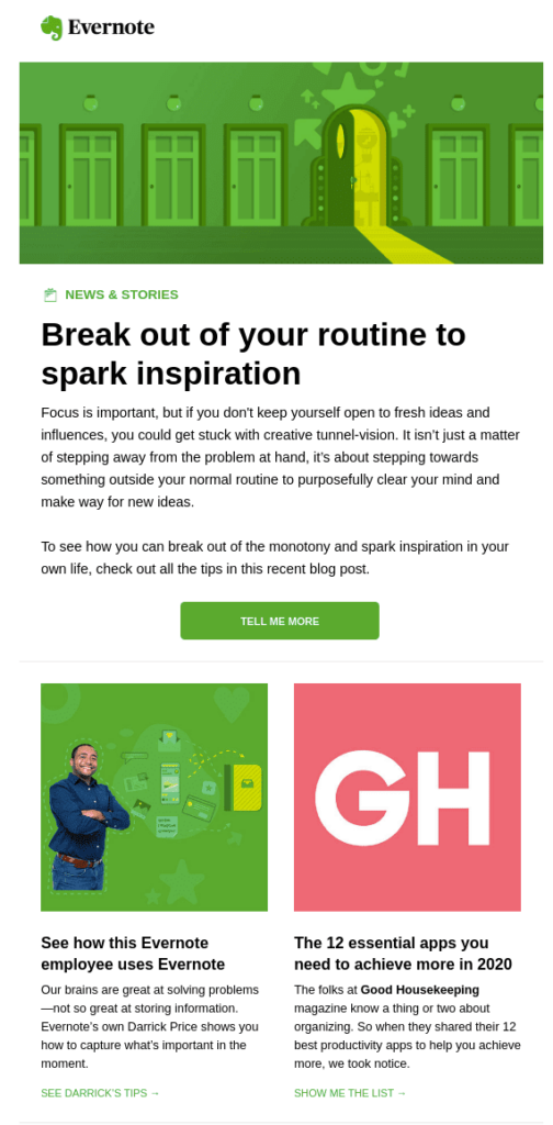
When something’s big it’s more attention-grabbing. Feel free to apply this logic in your newsletter layout and:
- give maximum space to the most important piece of information
- use bigger fonts to create typographic hierarchy
- Draw attention through color contrast.
This email from Evernote shows how it’s done:
All that said, your newsletter layout should have no more than 3 different sizes. Overlooking this means compromising on the visual straightforwardness of your email.
Follow eye movement/scanning patterns
Several eye-tracking studies report that people scan content, and it applies to emails as well.
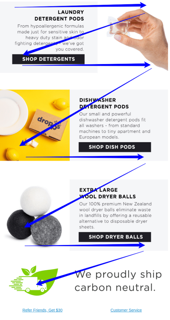
Dropps’ newsletter is a good example of how to capitalize on the Z reading pattern. Notice how the gaze shifts from one corner to another without being told.
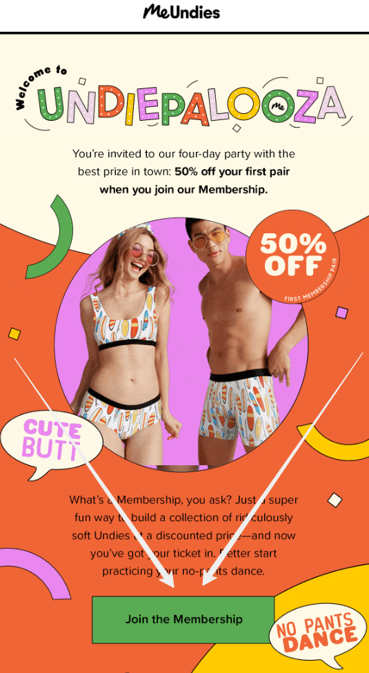
Next up is an example of the inverted pyramid newsletter layout which by default leads readers to the CTA. But remember: for the CTA to generate a click, your email copy should be aligned with the CTA copy.
Then comes the F pattern newsletter design which works brilliantly for plain text emails. From a design perspective, the goal should be to reduce cognitive load by:
- highlighting important information in bold,
- writing paragraphs that are no longer than a sentence or two, and
- Using bullet points where necessary.
For inspiration check out Marijana Kay's newsletter:

Bonus tip: Do a squint test or use this cool Chrome extension to vet your newsletter’s visual hierarchy. A blur test done on an email from Lush confirms that design scores high on visual hierarchy.
Further reading: 5 Email Design Best Practices for 2020
#2 Leverage negative space
Negative or white space is the space left between or surrounding design elements. You would have seen it in logos, posters, website layouts, and even in paintings. Could newsletters be far behind? Nope.
As it turns out, why using it amps up your newsletter layout design can be found in the Gestalt principle of proximity.
When elements are grouped, we tend to take a mental shortcut and perceive them as being related to each other compared to those spaced further apart. Suffice it to say, when used strategically, negative space:
- amplifies visual hierarchy
- draws attention to the CTA
- enhances scannability and readability by breaking the content.
Email from Everlane checks all the above-mentioned boxes. There’s a perfect spatial relationship between various elements and the overall layout. The logo and CTA stand out and the text is legible, engaging the user to scroll the entire length of the email.

#3 Use directional cues
Directional elements can be explicit (an arrow) or implicit cue (a person’s gaze). Both do a fabulous job by taking the effort out of the equation by suggesting recipients where to look.
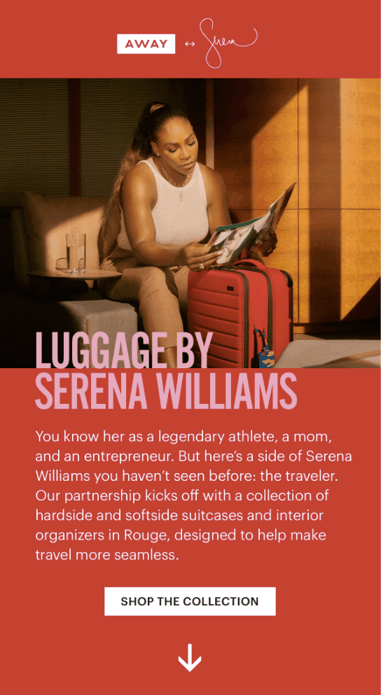
See the downward arrow in the email from Away? You can’t help but follow it and scroll down.
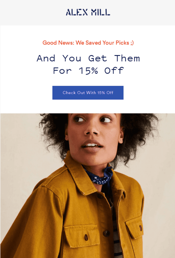
Similarly in the email from Alex Mill attention is immediately drawn to and rests on the CTA:
#4 Come up with a standout CTA
It’s true that subscribers, especially the less engaged folks are indeed commitment-averse, but you can design compelling CTAs if you stick to the basics.
CTA design
Despite several studies claiming otherwise, no one color guarantees conversions. What makes the real difference is using a color that provides a sharp contrast with the background. It creates an Isolation or the Von Restorff Effect, making the CTA stand out and elevating the visual hierarchy of the page.
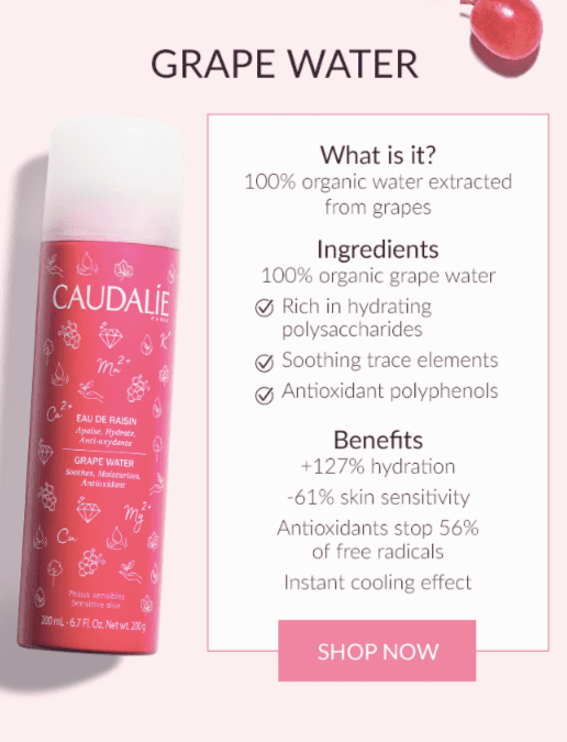
As for the CTA size, squint-test to check if it’s big enough and in harmony with the newsletter layout, like in the example below:
Number of CTAs
Like color, there’s not one lucky number that boosts email engagement. Though what’ll certainly work against you is overwhelming subscribers with way too many CTAs.
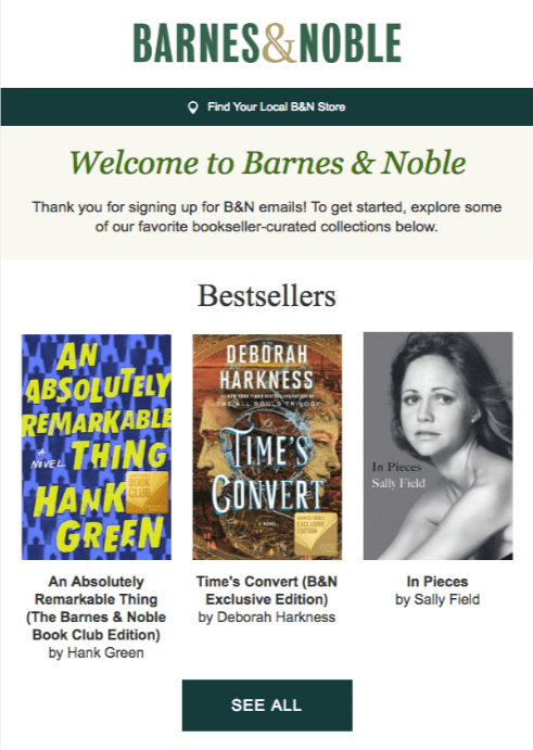
To avoid this, either have one call to action or if you must have more, change the button size or color of secondary CTAs. You could perhaps even stick to a theme, like so:
Correct placement
A lot is said about CTA placement, but like color and no. of CTAs, there’s not one sweet spot that guarantees conversions. Though what works is keeping in mind the popular reading patterns discussed earlier.
That said, in longer emails place CTAs at the bottom because anywhere else is but a distraction.
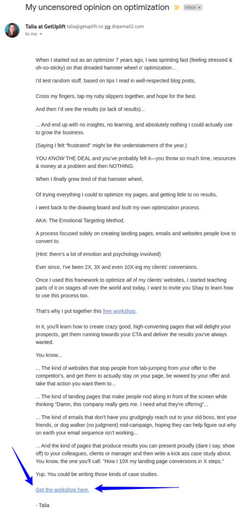
Then comes contextual placement.
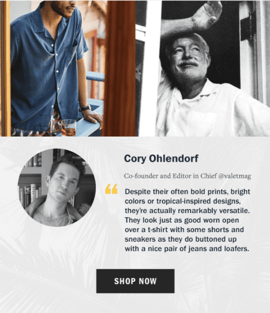
Social proof has a huge conversion potential. Notice how Huckberry’s CTA becomes stronger and prompts a click because it’s placed next to the praise from a real customer
CTA copy
Though a minor digression from design, know that without a good CTA copy you can’t persuade people to click on it. To optimize do as follows.
Use action words
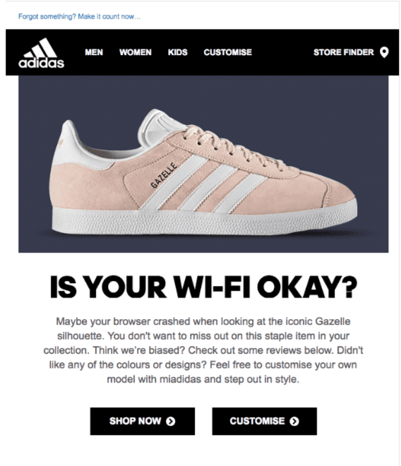
Whatever your value proposition, action words encourage a click as they imply achieving an objective. Think. ‘get it now’, ‘customize’, ‘shop now’, ‘join’ etc.
Use the first person ‘I’ or ‘me’.
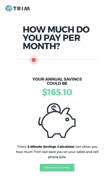
It shifts focus from you to the customer. ‘Count me in’, ‘Reveal my code’, ‘Start my free trial’, ‘I’m in’ are a few examples.
#5 Strong conversion scent (hint: branding)
Conversion scent is a term introduced by Bryan Eisenberg. In his book, Always Be Testing, he says:
“When you abandon your scent trail, you strand visitors and destroy the persuasive movement on your site.”
What it means is that unless you deliver a consistent pre and post-click experience, whether from an ad to a landing page or email to your website, you won't win your subscribers’ confidence in you.
To maintain a strong conversion scent and for them to know the email is from you:
- Add a logo. It’s the first thing that they recognize which then builds familiarity + makes your email trustworthy, not a scam.
- Be consistent with font type and color palette. However, since some email service providers don’t recognize all website fonts, set a default ‘web-safe’ font.
- Stay true to your brand’s tone and voice, whether in words or design. Just because colorful newsletters are pleasing doesn’t mean yours should be drenched in every eye-popping color.
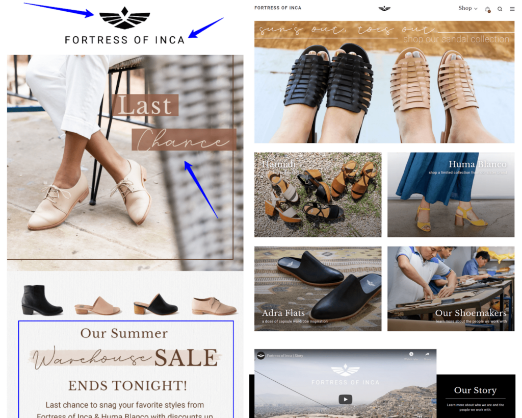
For comparison sake, look at the side-by-side view of Fortress of Inca’s newsletter layout and website. Every element discussed above is in sync with the overall look and feel of the website.
#6 Persuasive images
Newsletter images should be high-quality for they make emails visually engaging and appealing. But there’s more than meets the eye.
For maximum impact, use visuals that complement accompanying content and evoke positive emotions. Place them strategically to make your newsletter layout scannable. Maybe even throw GIFs into the mix.
Next, add alt text that best describes the image to increase your email’s accessibility. And as far as possible, stay true to your branding guideline to deliver a coherent experience.
What about the stuff not to do?
- Use the overused, cheesy stock images sparingly.
- Ration the number of images as too many can hamper quick load time.
- Avoid JPEG format for images with text.
#7 Responsive design
51% of customers aren’t just opening emails on their phones, they’re also comfortable shopping on their smartphones.
But when newsletters don’t render to their screen size it affects engagement and your business. Some even unsubscribe because of sloppy experience. So take stock of your subscribers’ mobile habits and design responsive newsletter layouts.
Use CSS media queries as dynamic rules that upon detecting screen sizes display emails correctly to improve customer’s interaction and experience with your newsletter.
If coding emails isn’t your strong point, you can always use a tool like Brevo’s fully responsive Drag & Drop email editor. Create mobile-friendly emails without the hassle. Test-drive the editor and all its features on Brevo’s free plan.
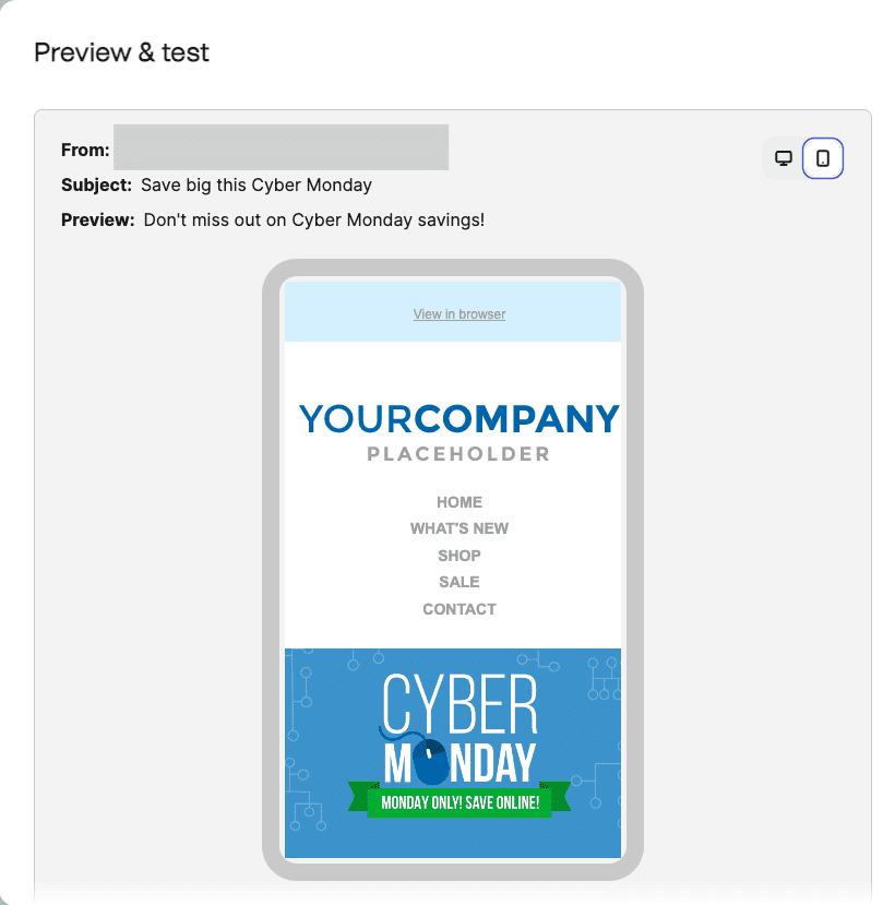
One last thing: never send emails without testing how they look on different devices. Use Brevo’s mobile preview feature to see how the newsletter layout looks on mobile.
Focus and fire with these newsletter layout tips
Congratulations, you’re now in the know of how to make conversion-driving newsletter layouts. Now get ready to unleash some creativity and tie all the loose ends.
Perhaps you can send your next one with Brevo? Guaranteed, the intuitive and responsive editor will make designing more fun. Go on, give it a go. You can send up to 300 emails per day for free.
By Sharanya Manola, freelance writer for B2B SaaS.


